Why are LINK and BAT decoupling from Bitcoin?

Whenever Bitcoin crashes, the rest of the market goes down with it. For better or worse, this is still how crypto works in 2019. That's why it’s particularly intriguing whenever an outlier or two manage to buck the trend, and successfully defy BTC’s massive gravitational pull.
On Wednesday - as Bitcoin lost 6.4%, dropping all the way to $7515 in a matter of hours - there were two notable exceptions to the market-wide downswing:
1. LINK, which actually recorded an ATH against ETH on the same day, and
2. BAT, which felt a slight tremor around BTC’s drop, but bounced back almost immediately:

This is not the first time that either LINK or BAT reliably decoupled from Bitcoin’s PA, which often seems to come as little surprise to the projects’ devoted fanbase:

Now, there’s a number of possible culprits behind BAT and LINK’s recent self-sustenance: high liquidity, strong speculator confidence, frequent project announcements and high-profile partnerships, active markets against both BTC and USDT, to name just a few.
But what about on-chain factors? Are there any network-specific indicators that might explain - or at the very least contribute - to their recent ‘anti-BTC’ rallies?
Here are a few patterns I’ve been paying attention to lately, and have noticed occurring on a number of breakout coins in the past few months:
Decline in 90d active coins
In one of his recent posts about Ethereum’s on-chain activity, dindustries made a compelling case for an inverse relationship between the % of active ETH and the coin’s subsequent price action:
“This significance that I am pointing out is simple, it's the law of supply and demand, or in this case activity and demand. It's clear to see that from 9 months prior to today, tokens active during the past year have been decreasing steadily. The rough figure, since December, 2018 is around 7,124,900 less active ETH. At current value, this is equivalent to ~$1.23B worth of ETH standing still. But equally as clear too is the rise in price during the past 9 months.”
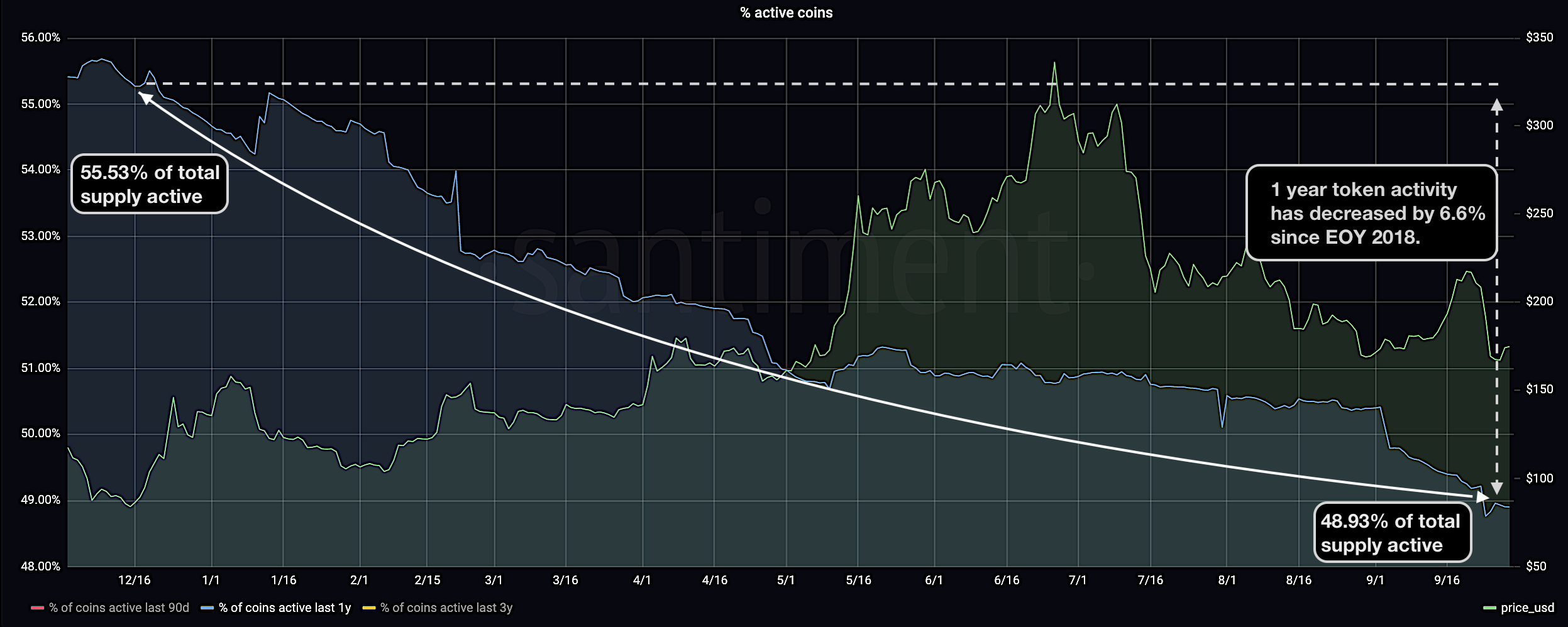

Sangraphs, Santiment’s advanced dashboards, give us a clean breakdown of the % of active coins across different rolling time frames (90d, 1y, 3y). In particular, the 90-day activity window has been proving quite insightful as of late.
For example, one of last week’s top-performing coins, ZRX, gained over 13% at a time when most of the crypto market was still decidedly treading water.
As it happens, 0x’s native token follows a very similar pattern to the one proposed by dindus in his ETH analysis: as the 90d active supply diminishes, the drop coincides squarely with the asset’s strong price appreciation:

Now, it’s clear that the above dip in early October is at least partly due to previously active tokens aging out of the designated time band. That said, a move is a move is a move, and as dindus mentions, “whether this happens drastically or slowly helps the analysts to determine, to some degree, the magnitude of importance.”
So given another strong showing by LINK and BAT in the face of rising adversity, let’s see if there are any notable trends we can gauge from their own 90-day active coin charts:


In both cases, the pattern holds true - as the amount of active coins over the past 90 days drops, the asset's price charts an upwards trajectory.
The fact that the coin’s short-term supply trends impact its PA shouldn’t come as too much of a surprise. Still, as the pattern seems to hold true for both ETH and at least three of the top-performing coins of the past few weeks, the ‘90d active coin’ trend could prove a supplementary indicator if you’re attempting to analyze an asset’s potential BTC resilience.
Exchange Flows and Whale Activity
Another notable on-chain trend shared by LINK and BAT is their respective availability/supply across exchange wallets. Sangraphs tracks this activity with 2 metrics:
1. Token Supply on Exchanges, which shows the cumulative amount of a selected token in more than 250 exchange wallets, and
2. % of Token Supply on Exchanges, which calculates the share of the coin’s total circulating supply on exchanges
I wrote in the past about the seemingly inverse correlation between the % of token supply on exchanges and its price. As this share continues to drop over time, the PA can sometimes follow in the opposite direction (and vice versa), possibly due to a waning sell pressure and tempered resistance from the speculative crowd.
When analyzing LINK and BAT’s exchange-related trends for the past 6 months, a number of charts also seem to support this theory.
For one, LINK’s withdrawal addresses have had a very active summer: the coin’s exchange holdings declined from 117M at the end of July to just above 91 million today - a 22.2% drop:

In a similar vein, BAT holders have been taking their coins out of the speculation pool for a long minute; the asset’s on-exchange supply dropped from 308.8M in June to 262.8M today, marking a 14.8% downswing:

As the graphs suggest, both coins’ shrinking supplies across all centralized exchanges seems to coincide with a favorable mid-term price action, eventually culminating in (comparatively) impressive October returns.
Which leads me to our third and final shared trait between these two outlier coins - persistent whale accumulation.
While the exchanges continued to slowly hemorrhage BAT and LINK throughout q2 and q3, whales proved unreservedly loyal to both projects, while adding indiscriminately to their bags. We can see this clearly on both projects’ Holder Distribution charts:

Since LINK’s ATH on June 30th, the cumulative balance of addresses holding between 1M - 10M LINK grew by 36.2M (~$102.8M at the time of writing), which is a 65% increase.
There is an opposite trend in addresses holding more than 10M LINK, which stands to reason if we assume that many of these are likely exchange wallets. Since the ATH, this holder category has shrunk by 35M LINK, which also corresponds to the aforementioned decline in the % of LINK on centralized exchanges:
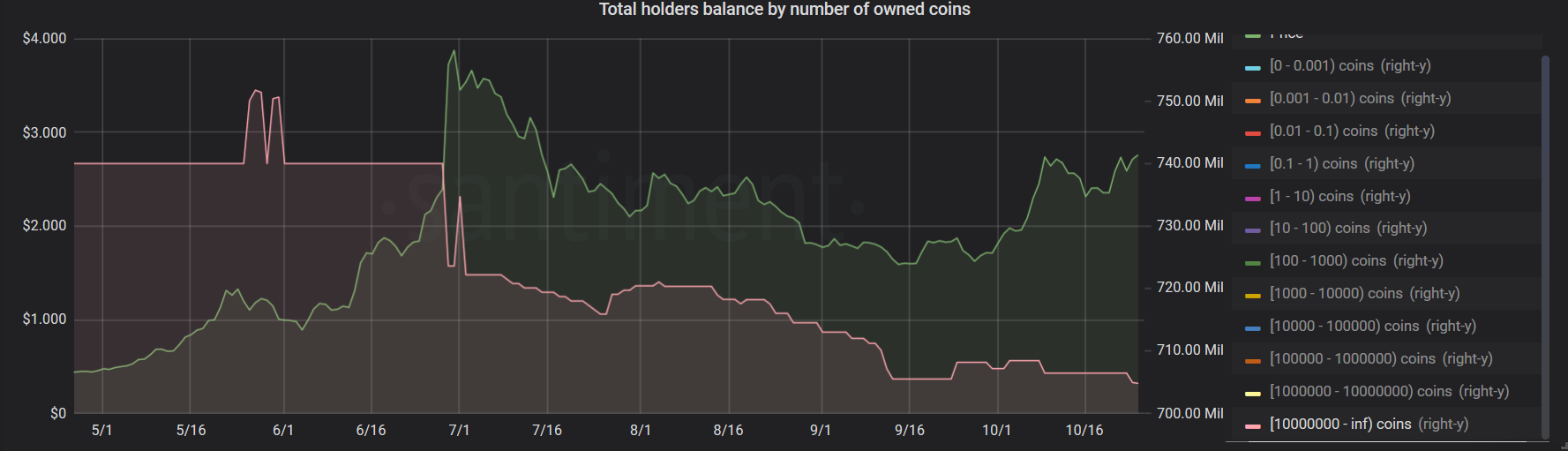
Virtually the same pattern repeats with BAT’s major holders: in the past 3 months, the combined balance of all addresses holding between 1M - 10M BAT has grown by 65.3M BAT (~$16.3M at the time of writing), which marks a 22.4% increase:

On the other hand, the ‘mega whales’ category (again, presumably dominated by exchange wallets), had shrunk by about 7% since July, corresponding with BAT’s decreasing supply chart on exchanges:

Like I said, there are many possible reasons for LINK and BAT’s recent decoupling from Bitcoin’s price action. While obviously not the sole culprit, these metrics are great in providing added context into both the short and long-term network activity of these outlier coins - or, really, any coin you’re interested in.
You can find all of the above metrics and charts on santiment.net/sangraphs.
Thanks for reading!
If you enjoyed this insight please leave a like, join discussion in the comments and share it with your friends!
Never miss a post from Ibis!
Get 'early bird' alerts for new insights from this author

Conversations (0)