Three Comparative Charts to Keep Tabs On!

Since the beginning of 2023, markets have become a bit more wide open than they have in quite some time. There are still long stretches of Bitcoin moving eerily flat compared to its historic volatility. But time and time again, there is a big breakout or a big drop just as the mainstream crowd is starting to fall asleep.
We've gone through many of our on-chain and social metrics here on the insights. But perhaps more underutilized are the comparative charts that are at your fingertips on the Social Trends page, available on Santiment's quick link side panel.
When the mainstream crowd gets behind a trend, it usually means it's time to dodge the direction everyone else assumes markets are about to move toward. Let's look at a few key examples of this right now:
$20k vs. $25k
With prices being in a range between $20k and $25k (for the most part) for about five weeks now, it may be a good idea to see how much the trading community is fluctuating between discussions related to these important psychological price levels.

If you'll notice, spikes in either price generally result in price direction change indicators. It makes the most sense that you'll see people calling for $20k when prices are dropping (indicating a bottom may be forming). And on the other hand, you'll see $25k being mentioned more when prices are rising toward $25k (indicating a top may be forming).
Buy vs. Sell
This chart will forever be useful, no matter what prices are doing at any given moment. The comparison of buy/bullish calls vs. sell/bearish calls is essentially the entire premise of our social trends page. When buy calls are high, prices are more likely to move down. When sell calls are high, prices are more likely to move up.

You can see that the biggest sell/bearish spike by far occurred on February 13th, right before prices in crypto markets surged. On the other hand, check out the more recent mini spike of buy/bullish calls on February 26th, at the precise moment that prices topped and began coming down again.
FOMO vs. FUD
Traders typically only bring up terms like FOMO (fear of missing out) and FUD (fear, uncertainty, doubt) when they are making fun of weak traders who are "falling for" the current trend. For example, when prices were really dropping hard around February 13th, look at how traders were pointing out all of the FUD they were seeing from others.
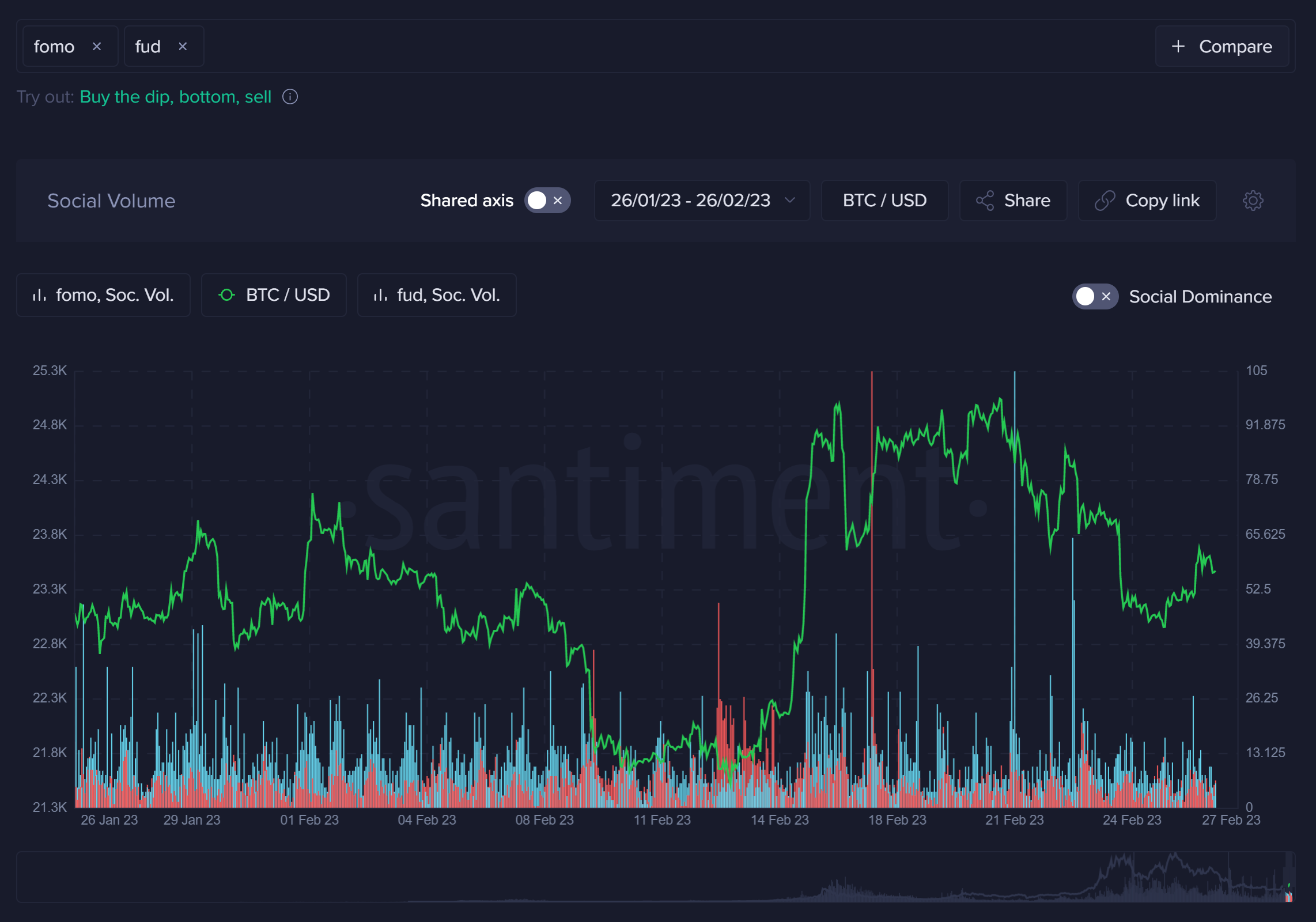
You can actually use this as a true indicator, as opposed to a counter indicator like the other two above examples in this article. In essence, traders are doing the work for us by pointing out when there is a lot of FOMO going on, and they are usually right... when there is FOMO indicated by these blue bars, check out how prices tend to top. On the other hand, red bars tend to imply there is a stronger probability of an upcoming price rise.
Hopefully these charts can be of use to you. Feel free to click the titles of each section, and bookmark them for future market analysis when you can't figure out which direction prices are about to head next!
-----
Disclaimer: The opinions expressed in the post are for general informational purposes only and are not intended to provide specific advice or recommendations for any individual or on any specific security or investment product.
Thanks for reading!
If you enjoyed this insight please leave a like, join discussion in the comments and share it with your friends!
Never miss a post from brianq!
Get 'early bird' alerts for new insights from this author

Conversations (0)