
A Year in Crypto: Santiment’s 2021 Market Report

This report was produced using Sanbase, Santiment’s token intelligence platform that helps users analyze the crypto market and find data-driven investment opportunities.
Start your free 2-week trial of Sanbase today.
2021 will go down as one of the most narrative-rich years in crypto’s short history.
It seems like every quarter has produced a year’s worth of storylines - from Bitcoin breaking new all time high, the commodification of meme coins, (re)emergence of NFTs, the propagation of bridges, L2s, sidechains and - like every year - a never ending onslaught of new ‘Ethereum killers’.
With so much going on, you’d be forgiven if you missed or glossed over some key industry developments over the past 12 months. Fear not - that’s exactly what this report is for.
In Santiment’s end-of-year digest, we look back at some of 2021’s most important market trends and what they tell us about the year ahead - all from the prism of on-chain, social and development activity.
Bitcoin: The Good Year
While most pundits and news outlets focused on Bitcoin’s historic price action, 2021 was a record-breaking year for its on-chain activity just as well.
Prior to 2021, the highest number of unique addresses sending or receiving BTC in a single day was recorded way back on December 14th, 2017, when a whopping 1.28 million addresses interacted with the Bitcoin network in one way or another.
This, of course, coincided with Bitcoin’s then-ATH price rally, which stopped short of $20,000 just a few days later. As the correction started, Bitcoin’s intraday network activity plummeted, dropping by -64% over the next 3 months and never recovering fully.
It took 3 years for Bitcoin to revisit the same level of wholesale network activity, and finally break through. In fact, it occurred just 6 days into 2021 - when BTC broke 36k$ for the first time - that Bitcoin’s daily active addresses soared to a new all-time high of 1.34 million.
This time, however, we wouldn’t have to wait years to see the record shattered once again. Four months later - on April 15th, 2021 - we would establish a new (and still-standing) ATH for Bitcoin’s daily active addresses, standing at roughly 1.36 million:

Daily active addresses (DAA for short) are often used by on-chain analysts as a proxy for token-related demand. And while past performance isn’t indicative of future results, sustained price rallies have often gone hand in hand with rising address activity (in BTC and other cryptocurrencies), suggesting a healthy network and an accelerating transfer of value among different entities.
To that end, it is highly encouraging to see Bitcoin’s address activity break new ground in 2021, and not just on a single-day basis. With its mean daily addresses at 989,000 - or just short of 1 million addresses/day - this was also the strongest year to date for Bitcoin’s address activity.
To put this in context, although 2019 wasn’t a bad year for crypto by all accounts, it hasn’t seen a single day where Bitcoin surpassed 1M DAA. In 2021, one million was almost the mean:

And while Bitcoin has facilitated unparalleled address growth in 2021, pricing volatility continues to play a key role in BTC’s on-chain momentum. Perhaps unsurprisingly, daily network activity was by far the highest in the first 5 months of the year, coinciding with the coin’s historic price rally and rising institutional interest.
As the May correction began, however, Bitcoin’s daily address activity quickly deflated as well, dropping by -53.74% in the next 3 months - eerily similar to Bitcoin’s 2017/2018 cycle:

Even with its Autumn price recovery and another ATH bid, Bitcoin’s network activity has struggled to revisit its start-of-year levels, and frequently proved unable to maintain the 1m+ DAA threshold.
As we close out the year, Bitcoin is once again showing negative network momentum in the short term, recording a -38% drop in daily active addresses over the last 3 weeks. If history is to judge, we should see a fresh wave of wholesale activity on the Bitcoin network to be fully convinced that another sustainable, historic rally is obtainable.
In fact, there are multiple charts that point to a cambrian explosion in Bitcoin’s on-chain activity to start the year, but a growing network inertia over the last few months. One in particular is Bitcoin’s Mean Dollar Invested Age, a metric initially developed by Santiment back in 2019:

Mean Dollar Invested Age (MDIA for short) may seem like a mouthful, but it’s more simple than it sounds. For each unit of Bitcoin, we determine how long it has stayed in its current address, compute the average of all those ‘ages’, and adjust it by the price at which each unit was last transacted on the blockchain.
Put simply, a rising MDIA slope points to a period where most units of BTC are staying in their respective addresses, daily value transfer slumps and Bitcoin investors (on average) pivot to HODLing. A declining MDIA slope, on the other hand, signals a period of ‘redistribution’ on the network and accelerated value transfer between market stakeholders.
As you can see below, multiple bull cycles in the past 7 years have coincided with a significant drop in Bitcoin’s mean dollar invested age, suggesting a rapidly declining average ‘age’ of Bitcoins and a more active network on average:

After more than a year, Bitcoin’s MDIA chart started to trend downwards in late 2020, coinciding with increased institutional interest in the coin and daily reports of multi-million investments in the asset.
Further signs of this network-wide redistribution effort can be found in the amount of active BTC on the network over the past 365 days, which mushroomed from 35% in November 2020 to 43% in May 2021:
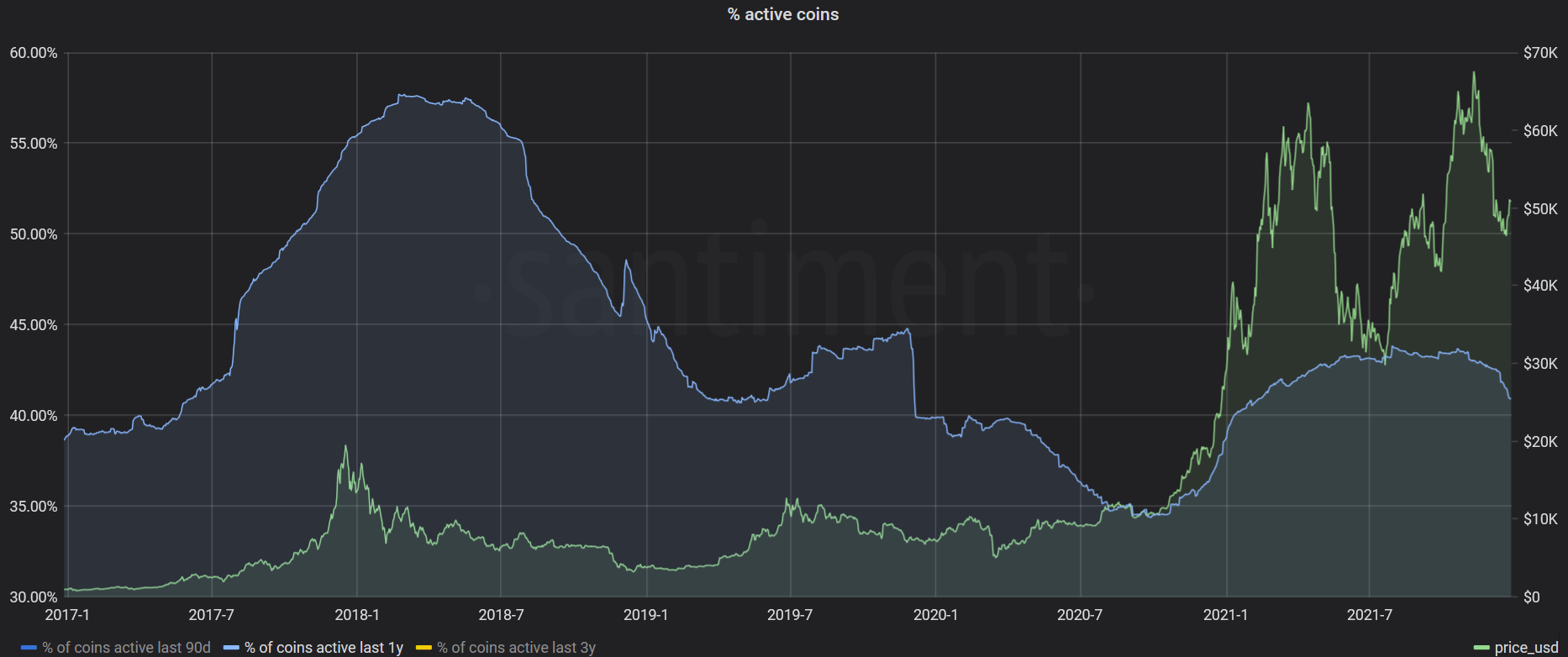
In other words, the Bitcoin network was springing back to life at the beginning of 2021, giving fundamental support for a prolonged price rally. Over the last few quarters, however, Bitcoin’s on-chain activity has ostensibly diminished; Mean Dollar Invested Age has once again started to incline, and the amount of active BTC in the past year first plateaued, then eventually dropped back down to 41% at the time of writing.
On the whole, we seem to be seeing a strong shift back to dormancy for many BTC holders, which may present an obstacle to a strong price recovery - at least in the very short term.
One possible exception to this is Bitcoin’s NVT ratio, which continues to flash green despite the above. The NVT ratio is an on-chain surrogate of the P/E (price to earnings) ratio, calculated by dividing Bitcoin’s market cap by the amount of unique BTC moving on the chain daily.
When the NVT ratio is red, it suggests that Bitcoin’s market valuation is too high relative to the amount of ‘value’ being transferred on its network and that the coin may be overvalued as a result - and vice versa. When it is green, it suggests that Bitcoin’s market cap may be too low relative to daily value creation taking place on the Bitcoin blockchain.
As shown below, Bitcoin’s NVT ratio continues to look semi-bullish for the time being, though even this is predominantly a function of its market cap declining rather than any recent spike in general on-chain activity:

On the whole, Bitcoin’s network-level activity in 2021 has been a tale of two halves, conveniently separated by a massive mid-year correction. However, it’s worth keeping things in perspective; even with the recent downtrend, Bitcoin’s current level of address activity is still an improvement to years past, giving some much-needed context to the coin’s impressive network performance over the last 365 days.
The tokenization of BTC
For most cryptocurrencies, periods of strong price appreciation typically prompt a new wave of sell-offs and interim profit taking, as holders look to de-risk and reduce their exposure. This is why it is particularly interesting that the amount of BTC located in known exchange wallets has shown the exact opposite trend, and has in fact heavily declined over the past year.
Despite Bitcoin’s November ATH, the most recent uptick in the availability of BTC on exchanges occurred at the end of May, a clear sign of panic sell-offs and ‘weak hand’ capitulation in response to the market-wide crash.
Since then, however, the total amount of BTC found on exchanges has shrunk from 14.32% of Bitcoin’s total circulating supply to roughly 11.8% today. That means there is around 450,000 BTC ($22.5bn at current prices) less sitting in exchange wallets today compared to just 6 months ago:

Some on-chain pundits believe that the ongoing reduction in Bitcoin’s availability on exchanges may eventually trigger a ‘supply shock’, which - assuming aggregate demand is unchanged - could propel Bitcoin’s price to new highs.
Leaving that aside for the moment, it is certainly noteworthy that Bitcoin’s total presence on centralized exchanges has been trending downwards ever since March 2020, and already sits at a 2-year low at the time of writing:

There’s a number of factors that have contributed to this trend, but we’ve been closely following one in particular - the growth of Bitcoin on Ethereum.
The advent of DeFi has allowed for the creation of entirely new financial primitives, and unlocked dozens of new use cases for digital assets. For BTC holders, it meant an appealing alternative to having your coins sit idle and collect dust on popular exchanges.
Instead, many have elected to put their BTC to work on Ethereum - whether by providing liquidity on Uniswap, depositing BTC on Aave or Compound, or a myriad other newfound opportunities to earn passive income on your BTC bags.
At the end of 2020, there was a total of 141k tokenized BTC, neatly wrapped and ‘living’ on the Ethereum blockchain. A year later, and that number has skyrocketed to 323k BTC, now accounting for 1.7% of Bitcoin’s total circulating supply:

While there are multiple ‘flavors’ of tokenized Bitcoin, wBTC holds the lion’s share of the market, with 258k wBTC currently on Ethereum, followed by 39.8k HBTC (huobi BTC) and 16.9k RenBTC.
Wrapped BTC is used as collateral on some of Ethereum’s most popular DeFi protocols, and shows no signs of slowing down. For instance, the amount of wBTC locked in MakerDAO’s CDPs has ballooned from 8.36k wBTC on January 1st 2021 to 54.6k wBTC today, marking a +553% increase:

With the DeFi sector continuing to make strides in 2021 (more on this later), it is difficult not to predict the propagation of tokenized BTC on Ethereum - and other blockchains - for years to come.
Barring a major shakeup in market-wide trends, it may only be a matter of time before we see the total amount of BTC accessible through centralized exchanges drop below 10% of the coin’s total supply. We’ll leave you to decide what that might mean for Bitcoin's price action moving forward.
The pitfalls of Bitcoin euphoria
Starting with Bitcoin’s journey through price discovery, followed by one of its biggest corrections to date and eventually crescendoing into another ATH rally, the past 12 months have been an emotional rollercoaster for retail BTC traders.
Through these market ebbs and flows, Bitcoin-related sentiment has continuously shifted on crypto social media, giving us a unique glimpse into the community’s biases and the impact of social chatter on Bitcoin’s PA.
At Santiment, we’ve been monitoring the day-to-day chatter on crypto social media for over 3 years, building one of the most robust social datasets available on the market.
At present, we collect data from over 1500 crypto-related social channels - including Telegram groups, subreddits, popular Twitter accounts and more - coming out to more than 100,000 text messages each day. Using this data, we’ve developed a number of metrics that shine a light on the mentality of retail traders and their collective response to major market events.
One of our most popular social metrics is Weighted Sentiment, which shows the average mood towards any particular coin/project based on text messages that we’ve collected from crypto social media.
For Bitcoin, this means we parse thousands of daily BTC-related messages through a machine learning algorithm that labels them as positive, negative or ambivalent towards the top coin. The end result is a chart that looks like this:

Based on several backtests that we’ve performed on our social dataset, there is a tendency for an extremely bullish sentiment to coincide with local price tops or incoming corrections (for BTC and other cryptocurrencies), while a predominantly bearish outlook may signal undervalued conditions and a potential for price recovery.
Looking at the above chart, we can see that Bitcoin-related sentiment has been unusually high on several key junctions over the past year.
For one, both the April and November rallies marked a strong uptick in average trader sentiment, suggesting fast-growing market euphoria and excessive retail greed - both indicators of a possibly overvalued market.
On the other hand, a number of Bitcoin’s local bottoms - including its July and October bounceback - originated from a predominantly bearish atmosphere, as most traders gave up on the coin and braced for future downtrend.
Perhaps the most interesting, however, are the sudden spikes in Bitcoin-related sentiment at the onset of large price corrections, including both the May and November crash, respectively. What this suggests is a sort of crash-induced euphoria, when many traders are looking to ‘buy the dip’ in hopes of a quick price recovery.
Both times, the bullish sentiment proved premature, followed by at least one more leg down for the top coin. This supports our long-standing belief that the ‘crowd’ is often too early on their ‘buy’ calls, prompting the market to inflict further pain and properly neutralize the bulls.
Another example of this can be seen in the amount of ‘buy the dip’ mentions that we collect from crypto social media, which typically soar around the start of Bitcoin’s downtrends, signaling the market is still ‘net long’ and the correction may be far from over.

On the other hand, actual price bottoms - like the ones in July, September and most recently, December - are often marked by a distinct lack of ‘buy the dip’ voices, as the retail sector shifts to predominantly bearish, allowing room for a more sustained price recovery.
You can find these and other social metrics for Bitcoin, Ethereum and over 2000 other cryptocurrencies on Sanbase, as well as our Social Trends tool.
Devs, DeFi and Down the line
While it has little to no impact on short-term market trends, development activity is quite an underrated indicator of project success, as it demonstrates the team’s month-to-month commitment to creating a working product, polishing and upgrading its features, and staying true to the long-term roadmap.
At Santiment, we track development data from 1000s of public github repositories, while excluding various ‘non-dev events’, like comments on commits, people following an issue, downloading releases etc. If such events weren’t excluded, some projects could show inflated development activity just by discussing what they are going to build without actually building it.
With that it mind, below is a list of top 20 projects by aggregated development activity - based on their publicly available Github information - for the year 2021:
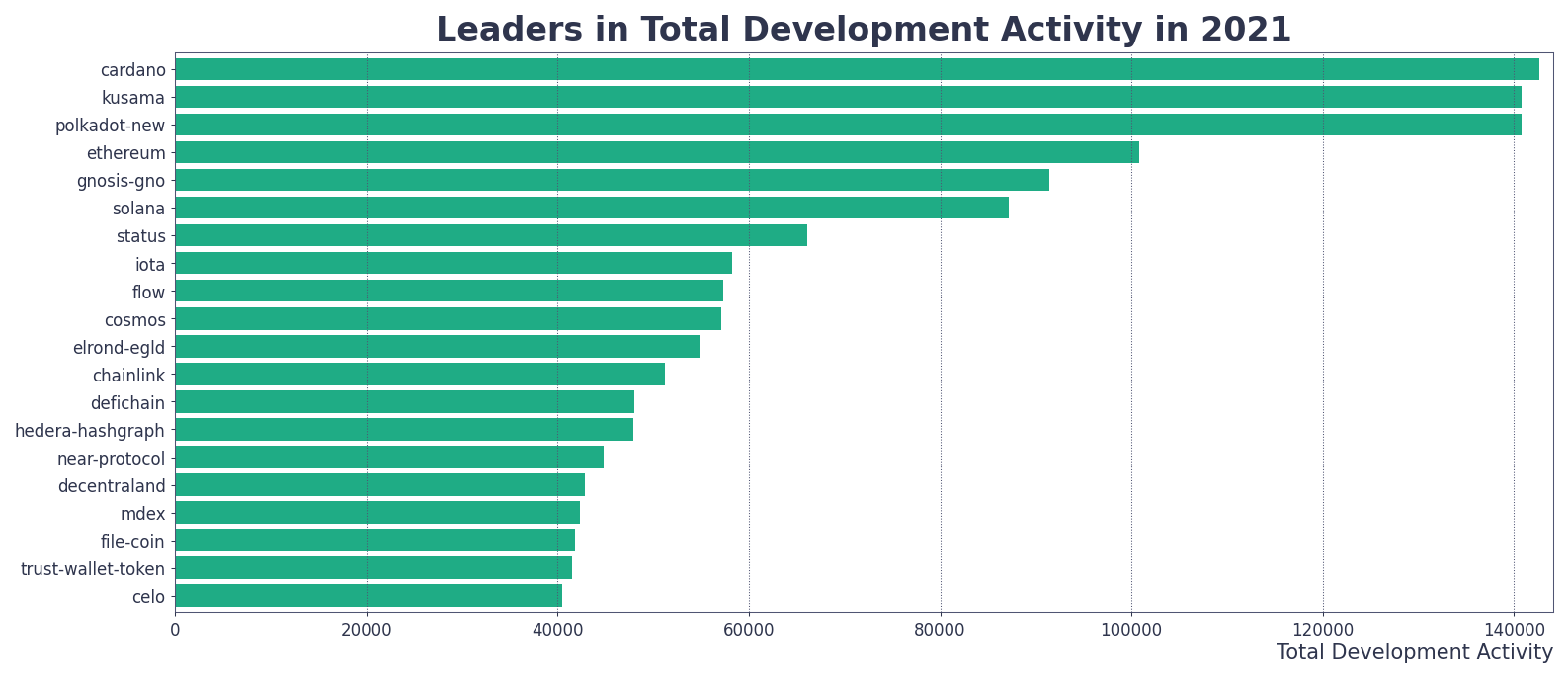
As evident, the top 3 projects - Cardano, Kusama and Polkadot are virtually neck and neck, followed by Ethereum at #4 and Gnosis at #5. For the first time on one of these end-of-year development reports, we also have an NFT-centric project in Flow to round out the top 10, highlighting the meteoric growth of the NFT sector in the last year.
Outside of ‘pure’ development activity, we also track the amount of active contributors to any project’s Github repo, for broader insights about their ‘developer network’. Below are the industry leaders in the amount of active Github contributors over the last 12 months:

While the top positions remain unchanged, Cardano now towers above the rest, with an average of 53 daily contributors to their Github repo throughout the last year. The amount of active contributors also sees a few interesting changes within the top 10, which now includes the Trust Wallet Token and Filecoin, to name a few.
The above list(s), however, look at the entire crypto landscape, meaning large projects with active developer communities are naturally going to dominate. As such, it’s also a good idea to zoom in on the particular segments of the crypto market and shine a light on the more ‘niche projects’ that invested heavily in their coding manpower in 2021.
With over $103bn locked in various DeFi protocols (+292.8% increase in 2021), decentralized finance remains one of the bedrocks of the crypto industry, acting as the primary hub for both large-scale innovation and mainstream adoption.
And while competing narratives and new (actually old) industry trends took some of the spotlight away from DeFi in 2021, the sector has continued to make headway thanks to sidechains, bridges and layer2 solutions, evolving into a robust, multi-chain ecosystem that didn’t exist just a year prior.
With that in mind, here are the top 20 DeFi-related projects that lead the way in development activity (based on public Github repository data) in 2021:

Interestingly enough, DeFiChain claims the top spot for the year, followed by Mdex and SifChain. Far less surprising is the rest of the list, populated by some of the year’s most utilized protocols, including Uniswap and its BSC counterpart PancakeSwap, Balancer, Yearn and Maker.
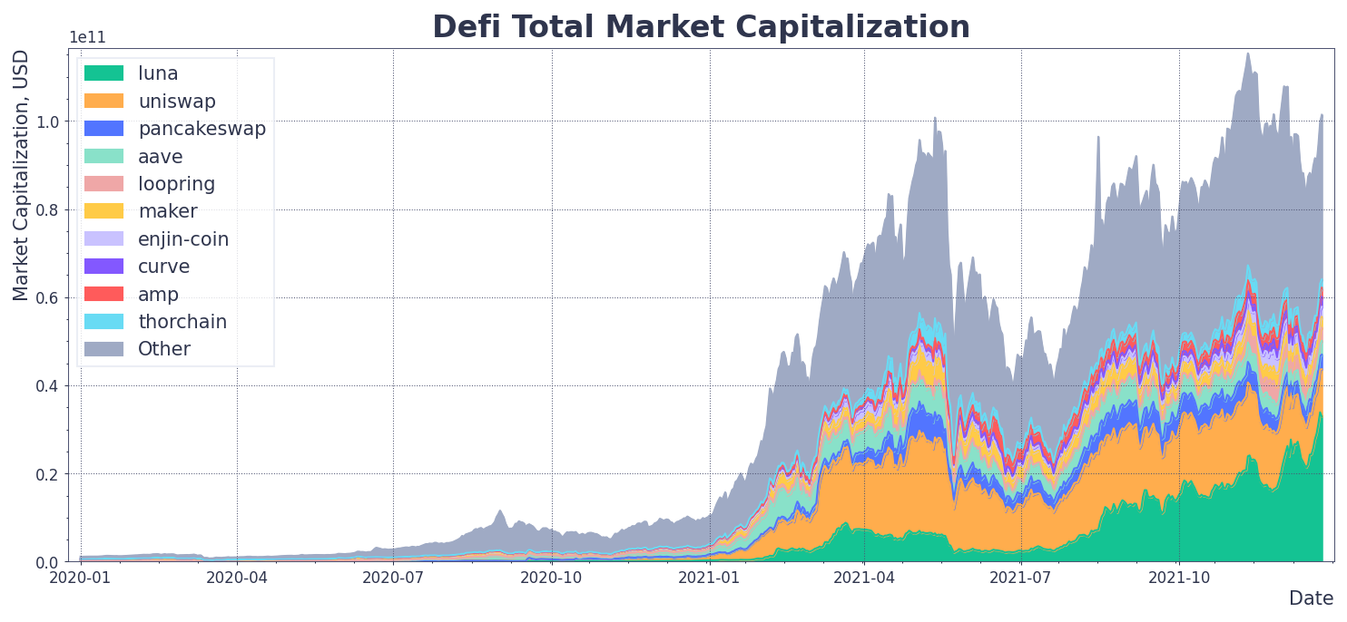
As a whole, the DeFi sector has ballooned to new highs in 2021, both in terms of market capitalization and wholesale on-chain adoption. At the end of last year, DeFi’s market cap stood at just over $7.7bn, a threshold that was easily beat thanks to the market-wide rally and a litany of new protocols.
According to our manually curated DeFi watchlist, the total market capitalization of DeFi-related tokens has officially peaked on November 10th, shortly before the market-wide correction.
Last year, all of the top 10 DeFi coins by market cap were based on Ethereum, spearheaded by the likes of UNI, YFI and AAVE. This time around, we can see several non ERC-20 assets atop the list (LUNA and CAKE being the most noteworthy) signaling a slow but steady shift towards a more universal, chain-agnostic DeFi.

And while decentralized finance is no longer a one-chain pony, Ethereum remains the largest hub for DeFi-related dapps, at least for the time being. With that in mind, it’s worth taking a closer look at the network activity of Ethereum-based DeFi tokens over the past year.
Alongside the market-wide rally, the total amount of addresses interacting with (Ethereum-based) DeFi tokens soared in the first three months of the year, peaking at just over 100,000 in early March:
Note: we have excluded UNI’s daily active addresses from the above chart because of the coin’s 2020 launch, which still dwarfs all DAA-related activity. Adding UNI’s daily addresses to the mix can be seen below, and brings the 2021 peak for all ERC-20 DeFi tokens to just over 110,000 total daily active addresses:

In the same vein, the amount of new addresses interacting with DeFi tokens on Ethereum (in a single day) skyrocketed to 50,000 in early March, outshining the peak of ‘DeFi summer’ back in 2020:

On the whole, it’s safe to say that some of the BTC-related euphoria trickled down to DeFi coins, especially in Q1 of this year. Since then, however, Ethereum-based DeFi assets have struggled to maintain the same level of daily network interaction, showing a similar pivot to network inertia as Bitcoin in the later months.
The total amount of daily addresses of DeFi assets has dropped by 72.7% since the March peak, hovering at ‘just’ 30,000 at the time of writing. Along the same lines, the amount of new addresses interacting with ERC-20 DeFi assets daily has declined by -82% over the past 9 months, presently sitting at 9,000 total.
The decline in daily DeFi-related network activity on Ethereum over the past few months can be attributed to a number of factors, including the propagation of other-chain DeFi protocols, the rise of NFT mania and a general dip in crypto market capitalization.
However, even with the recent ‘thawing’ of network-level activity, the DeFi segment on Ethereum has made massive strides in 2021.
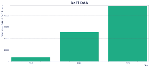
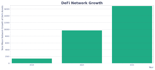
For instance, the average amount of daily addresses interacting with ERC-20 DeFi coins still far outshines the previous years, sitting at just below 50,000 for the past 12 months. Compare this to the average of 25,000 daily addresses in 2020 and just 3,000 daily addresses (on average) in 2019:
Similarly, the average amount of new addresses interacting with DeFi coins on Ethereum daily has climbed to 16,500 in 2021, a notable uptick from an average of 9,800 new addresses in 2020 and 1,800 addresses in 2019:
Put simply, even with the seasonal dip in the on-chain activity of ERC-20 DeFi tokens - very similar to the end of 2020 - the ecosystem as a whole has continued to break new ground in 2021, nearly doubling the average amount of unique and new addresses interacting with the assets daily.
With that, even as demand for DeFi tokens becomes sharded across competing blockchains and flavor-of-the-month protocols, we find it difficult to see 2022 as being nothing but another record-breaking year for DeFi on the Ethereum blockchain.
ERC-20s: The year of variety
There’s plenty more to Ethereum than just DeFi that should warrant your attention. This is why every year we take a look at the on-chain activity of all ERC-20 assets, for clues on the projects gaining traction, the prevailing network trends as well as the overall health of the Ethereum ecosystem.
Between the NFT mania, rise of meme coins and the emergence of DeFi 2.0, the past 12 months have left a strong imprint on the Ethereum network. With that in mind, here are the top 20 ERC-20 assets by daily address activity for the year 2021:

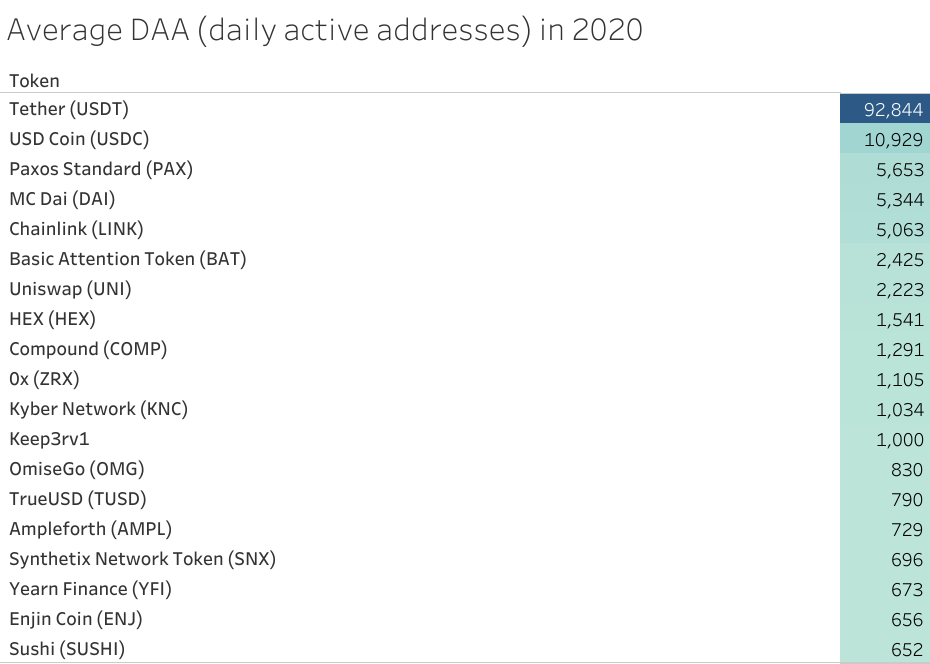
Similar to years past, one asset - ERC-20 USDT - dominates the landscape, clocking in an average of 88,000 addresses per day. To give that some perspective, the average amount of daily addresses for all Ethereum-based DeFi coins combined stands at 50,000 over the past year, showing the extent of Tether's hegemony on the Ethereum network.
The stablecoin remains by far the most popular asset on Ethereum, nearly doubling the amount of daily interaction compared to its runner-up, Binance Coin (BNB), which recorded an average of 46,000 daily addresses throughout the year. Still an impressive showing for Binance’s Ethereum token, which didn’t even manage to break into the top 10 of this same list last year.
What’s worth noting, however, is that the gap between Tether and other top-used coins on Ethereum seems to be narrowing. Last year, USDT had 8 times more daily activity than the second-place finisher in USDC. And while the discrepancy is still massive, USDC (which now sits at #3 with an average of 31,000 daily addresses) is now roughly used ‘just’ 2.6 times less often than Tether on a daily basis.
Outside of BNB, there’s a few other - perhaps more surprising - newcomers to the list of the most used assets on Ethereum in 2021. Meme or not, the SHIB token has managed to claim the #4 spot with an average of 13,000 (!) daily active addresses throughout the last year. That is more than wrapped ETH (at #5 with 11,000 DAA), LINK (#6 with 8,000 DAA) or DAI (#7 with 8,000 DAA), all well-established projects and de-facto staples of the Ethereum ecosystem.
The top 10 list is rounded up by SLP, the in-game currency of a wildly popular blockchain game Axie Infinity, which recorded an average of 4,000 daily addresses over the course of the year. Right below it is Decentraland’s native token (MANA), showcasing the rapid growth of the NFT sector in the last 12 months.
Overall, what is perhaps most striking is the amount of diversity in this year’s lineup of the most utilized ERC-20 coins. Compare this to the 2020 leaderboard, which is dominated by stablecoins and DeFi ‘blue chips’, with little to no real representation of other emerging market trends:
In 2021, the Ethereum network has continued to evolve and facilitate a still-unique variety of use cases and customer personas. From stablecoins to NFT games, meme coins to DeFi primitives, the Ethereum ecosystem looks healthy as ever, despite the neverending onslaught of ‘protocol killers’ and smart contract platforms vying for its throne.
NFTs: More than passing fancy
‘Twas the year of the non-fungible tokens. Prompted by the success of NBA Topshot and Beeple’s $69m auction, the NFT mania has gone supernova in 2021, breaking into the mainstream and quickly becoming one of the most polarizing trends in crypto’s short history.
OpenSea, one of the largest NFT marketplaces, facilitated over 7.2 million trades in 2021, amounting to a total traded volume of $15.5bn:

On the whole, over 720,000 unique addresses have purchased an NFT on Ethereum in the last 12 months, with a daily peak of 86,000 trades recorded on October 4th, 2021.
And while the intraday NFT trading on Ethereum plummeted throughout October (likely due to meteoric fees), the trend has once again flipped to the upside since, with the amount of daily NFT trades improving by +359% in the past 50 days alone. To anyone that tells you that the NFT hype train is out of gas, send them the above chart.
In terms of USD, the biggest day for NFT trading on Ethereum was August 29th, with $254m worth of NFTs (dominated by Cryptopunks and Mutant Ape Yacht Club) changing addresses. And while that was a clear outlier, daily NFT trades on Ethereum still regularly overshoot $50m in value, and have in fact seen a steady resurgence over the last month:

And while many believe that NFTs are a whale’s playground, the data shows major interest in non-fungible goodies among the retail sector. The amount of daily unique addresses that purchased less than $1k worth of NFTs on Ethereum peaked at 18051 in October and - following a major drop in November - is once again up by +254% over the past 50 days:

Again, the November drop-off may look like a major decline in wholesale interest towards NFTs, but it is likely at last partially prompted by an uptick in the average cost to interact with the Ethereum blockchain (as seen below), which priced out many small-ROI interactions:

All in all, with transactional fees coming back down to earth, the NFT-related activity on the Ethereum blockchain is flourishing once again, suggesting that the non-fungible ‘fad’ has more legs than some may think.
Addendum: Our Favorite Market Indicators in 2021
For the past four years, our main goal has been to find and develop new ways to ‘read’ the crypto market, and better contextualize the behavior of its key stakeholders.
In 2021, our platform hosts more than 200 different metrics (many of them built from the ground up) and provides on-chain, social, development and other information on over 2400 cryptocurrencies.
Needless to say, it can be difficult to know where to start, what to look for, or how best to use the Swiss Army Knife that is fundamental analysis.
To help you on that journey (and make sure you don’t cut yourself), we asked several Santiment team members to choose their two favorite Sanbase metrics in 2021, and exactly why they find them useful:
1. Garry (Average Gas Used in Gwei + ETH Fee Distribution)
“One of the best tools to relieve transaction cost pains. Whenever I need to rebalance my portfolio or act on Ethereum-based assets, I check the Average Gas Used in Gwei metric to find a nice entry point when fees are low. Hint: lowest fees usually happen on weekend mornings. Spoiler: there will be an alert on this metric available.

Spikes on the Gwei chart also make me look closer and investigate the reason behind the uptick. Sometimes this can reveal some very interesting events, like legendary NFT mints, gas wars on something rare etc.
The second dashboard I often refer to is the Fees Distribution chart. Why? Because it’s able to pinpoint exactly which token caused the short-term spike in fees. This dashboard is also great at highlighting tokens with strong crowd demand at the moment. And finally, a token that suddenly appears in the top 5 by gas consumed can often be at risk of a correction - as seen for UNI, DYDX and ENS, to name a few”
2. Kelvin (MVRV ratio and Holder Distribution)
- “The MVRV ratio shows the average profit/loss of all the coins currently in circulation according to the current price.
Using time-bound 30-day MVRV, from our experience, the ‘danger zone’ tends to be +20% and above, signalling that there's a high chance that holders will be taking profits soon. However, it does vary from project to project so it's best to compare where the historical 30-day MVRV ratio tops out for any project.
Likewise, a negative MVRV 30D of around -15% to 30% can often be appealing for asset accumulation. But once again, it varies from project to project and it's best to refer to the historical data to determine opportunity and danger zones.

The Holder Distribution metric breaks down the number of holders (unique addresses) by the amount of tokens they hold. For instance, 0-1 BTC , 1-10 BTC etc. This helps us to identify and monitor the behavior of retail and the whales.
Typically, when we see a drop in the lower tier of holder distribution, it means that the retail folks have capitulated and that might be an opportunity to consider a position.
Alternatively, if there's a spike in the higher tiers of holder distribution, it could mean that whales are accumulating and if indeed they are the smart money, then it might be worthwhile to do the same.
However, it's important to take in consideration the price action as well. The ideal scenario for the above example, would be a quiet price action or a deep corrective one.
On the other hand, the price going up alongside a spike in the lower tiers of holder distribution, may signal the crowd is FOMOing in and is generally not a good sign: a top may be forming soon.
Price going up alongside a drop in the higher tiers of holder distribution, may signal that whales are beginning to offload their bags and so it might be a good idea to follow suit.”
3. Brian (Whale ‘Key Stakeholder’ Behavior)
"When analyzing whales and their impact on upcoming market price fluctuations, it’s important to note that the absolute top tier, largest addresses in an asset are typically some of the most inactive. Many times, these are associated with exchanges or intended for liquidity purposes. The actual addresses to hone in on to provide proper alpha are the ones typically in the ‘millionaire tier’.

Addresses that are holding anywhere from $500k to $5m (or even $500m for the largest assets like BTC or ETH) are often the key to revealing how the largest retail traders are positioning themselves for an upcoming price spike or drop.
3.1 Mean Dollar Invested Age
Mean dollar invested age is a fantastic metric to gauge when dormant investments (in USD) are moving addresses, and the network is circulating at a healthy (or unhealthy) degree. When large sums of previously dormant tokens are suddenly moving, this will move the average age in which the network’s tokens have sat in one spot, downward.

A forming downward slope on the mean dollar invested age chart, as we see for Bitcoin, often is indicative that the price is in a bull run. Prices very often rise during the beginning of a downward slope movement, and act as a ‘justifier’ to show whether an initial rise is being backed up by healthy and increasing dormant token movement.
Alternatively, if the mean dollar invested age of an asset is beginning to rise, this may be indicative that a network is beginning to become stagnant. If large quantities of investments are beginning to become stale and not circulate as they once were, it is a warning flag that prices may suffer until this trend changes."
- 4. Maksim (Multi-volume divergence)
- Besides the metrics already mentioned in the BTC section, Maksim enjoys using simple yet powerful (when combined with the specific framework) metrics to spot trend reversals. In particular, Max is a big proponent and the unofficial author of the multi-volume divergence framework.
Multi-volume divergence consists of several metrics, which can all be used to track the amount of demand in digital assets. These include daily active addresses, coin-related social mentions and trading volume.
Put simply, sustainable price rallies often go hand in hand with rising network, social and exchange-related activity. While local corrections are possible, growing price action can be deemed healthy as long as it is accompanied by expanding fundamentals.

A fading trend, on the other hand, usually manifests with a “divergence” between the price (still growing) and the concurrent decline in these base-level indicators. This trend also has a simple behavioural explanation: at this point, everyone is already “in” the trade, meaning there’s little new money to pull in (i.e. less buy side pressure). No new money = end of the game, music stops playing.
(Please note: this occurs often, but not always. Some price tops will still exhibit their explosive, not fading, nature.)
On the whole, you should observe a complete set of volume metrics — trading, social and on-chain volume — to validate your market findings from multiple angles. Once all volume metrics start to exhibit “toppish” behaviour and begin to diverge from rising PA, it may be time to consider reducing your long position.
Disclaimer: The opinions expressed in this report are for general informational purposes only and are not intended to provide specific advice or recommendations for any individual or on any specific security or investment product.