Using Santiment's Bitmex Funding Rate Metric to Profitably Trade Against the Crowd

We've got yet another great price-leading Sansheets model now available to our amazing Sanbase PRO community! Our new Bitmex Funding Rate Model, available to freely download (but requires your Sanbase PRO API to use) explores how to trade against the sway of the funding rate on Bitmex. Currently, the model is available for all of the large cap assets where the funding rate is available on their exchange. So you can easily compare between Bitcoin, Ethereum, XRP Network, Litecoin, Chainlink, and Bitcoin Cash, to find which asset has the most negative funding rate (for buy opportunities) and most positive funding rate (for sells).

In case you aren't familiar with this powerful metric, the Bitmex Perpetual Contract Funding Rate metric (its official term on our Santiment Academy) is a fee paid by one side of the perpetual contract to the other. When the funding rate is positive, Longs pay Shorts. When the funding rate is negative, Shorts pay Longs.
To translate, when this funding rate gets high, it means there is an excessive amount of long contracts opened. As those who have been part of the Santiment community for a while now have learned, prices generally move in the opposite direction of crowd expectation. So this excessively high rate would be indicative of a local top forming, and a higher than likely chance of prices dropping.
On the other end of the spectrum, if there are many shorts opening (positions where the crowd is betting that the asset will go down), this is a good opportunity to buy, and generally is when local bottoms occur.
So, the question is... how do we figure out when this funding rate is actually high or low? By using historical context, of course!
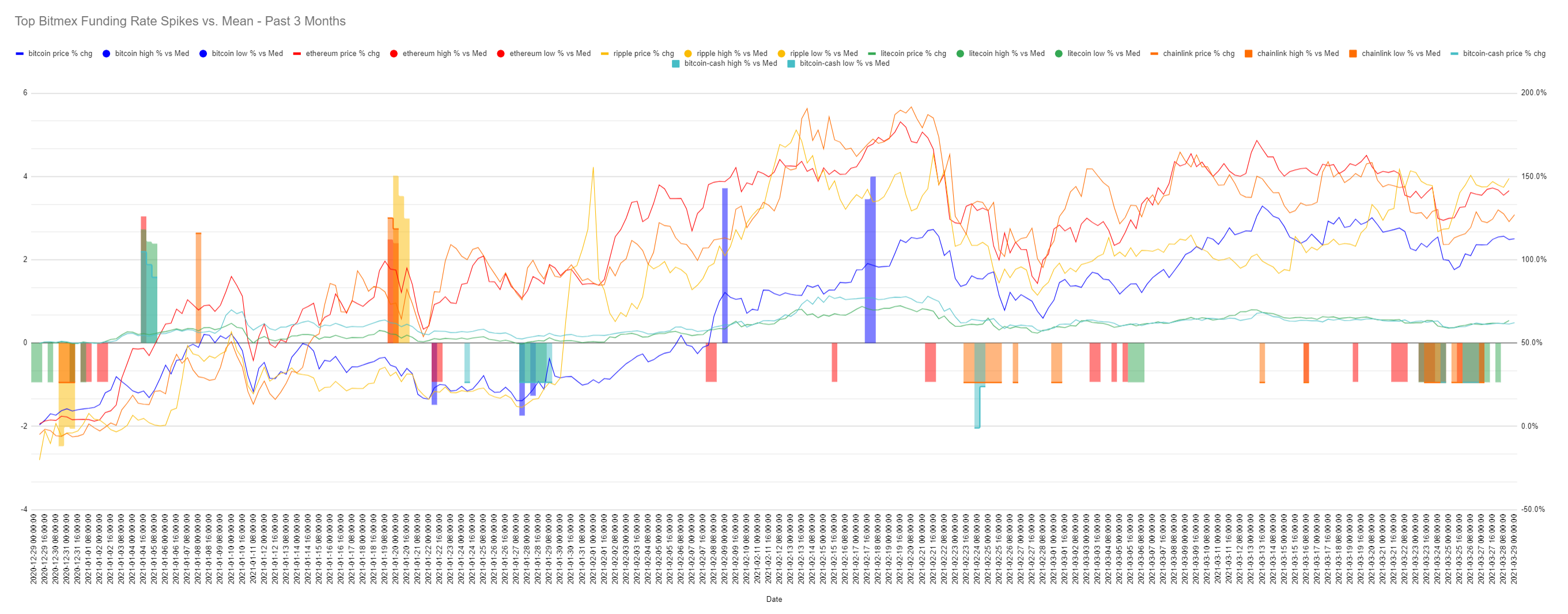
Behold, the most useful chart of the three offered on this model:

What we see here are the occurrences of the top 10 and bottom 10 spikes and dips for each asset on this model. For easy comparison of all assets on the same chart, they are set to show the percentage changes against their means, rather than the actual numbers (which could end up skewing some assets higher or lower than others).
You may notice that the high spikes, such as the blue representing Bitcoin, often come either right at or right before, a local top on the blue Bitcoin price line. This makes sense, as it's when greed is beginning to be a factor, and too many long contracts have been loaded up on compared to shorts.
As we covered, when too many traders are betting for the price to go up (which usually happens as prices are already rising), traders tend to get overconfident and open leveraged long positions in abundance. This is what is reflected via those large high candles.
And, of course, on the flip side, when you see the low bars, this is when the crowd is shorting (betting against) a crypto asset. Note the low blue bars on the left side of the chart, which occurred right before Bitcoin's price (in blue) began to rise. You can also see it very clearly in the beginning of the chart with XRP's yellow bars, when traders were shorting excessively following the SEC lawsuit news. XRP's price ended up jumping up quickly, and many of those Bitmex shorts were liquidated!
If the chart is a bit too noisy, you can also head to the Data tab, and adjust from 10 high/low spikes for each asset, to something like 3.

Now you only see the 3 very highest, and 3 very lowest outliers for each asset to really find the extremes.
Change this number to whatever you'd like, and the chart will automatically adjust to show as many (or as few) outlier spikes for each asset's contract funding rate as you want to see!
For simplicity, this model also offers a simple snapshot of where each asset's Bitmex funding rate currently sits at, and will also include the 1-day and 7-day price changes.

Currently, at the time of this writing, all funding rates are positive. But this certainly will not always be the case, and you'll see the green candles turn red when they fall into negative territory.
This model should be an amazing addition to our ever-growing lineup of great models that you can download and plug in your own Santiment API into and improve your trading. And like all of our Sansheets models, these are all auto-updating as you refresh it over time as long as you're a Sanbase PRO member!
If you don't yet have Sanbase PRO, you can make an account and try it for 2 weeks free of charge. Explore everything on Sanbase on top of gaining access to this model. Whether you try a 2-week trial, or go straight for the $45/month full membership, here's how to access the model described in this article:
Once you have your Sanbase PRO account (or if you already do), you'll then want to check out any of the model links below and go to File -> Make a Copy, and simply:
1) Download Sansheets: https://academy.santiment.net/sansheets/setting-up/
2) Plug in your API: https://academy.santiment.net/sansheets/adding-an-api-key/-----
3) If you're having trouble getting the data to load on a model, head to the 'Data' tab on the far right of the spreadsheet, and go to the yellow cell. Then delete the cell formula, then hit Undo. This should manually refresh the data.
Disclaimer: The opinions expressed in the post are for general informational purposes only and are not intended to provide specific advice or recommendations for any individual or on any specific security or investment product.