
Top Token Holders and Their Role as Leading Indicators

Click Here To Access Our Free Sansheets Model With 30-Day Trailing Data (Explained Later in Article)
Spotting Entries and Exits Through Top Holders
You may have always wondered what the top investors of some of your favorite (or not so favorite) assets are doing with their tokens at any given moment. You may have even heard of ways of keeping tabs on their all-important "whale" addresses through the 'Top Holder' metrics that we offer on Sanbase, Sandata, and Sansheets. If so, you may be curious as to how we are able to track the largest capital investors of each ERC-20 project. Well, blockchain technology has a built-in way to track any address movement as many of you know. And we naturally wanted to automate and utilize these address-tracking abilities to the best of ours. If you haven't already checked out our featured Santiment Academy article about it, here are the clif notes:
Santiment's Top Holders metric, available on Sanbase, Sandata, and newly as a Sansheets model, "...describes a set of up to 100 Ethereum addresses which have the highest balances at a given time, either in Ether or in a specific ERC-20 token. The amount of addresses can be reduced, but 100 is the maximum. So one could analyse the 20 top holders for BAT, as well as the 100 top holders for ETH."
Multiple Ways to Query Through Sandata
Using data extracted straight from the blockchain, these top holder metrics reveal what those Ethereum or ERC-20 addresses are holding, and you can customize queries for them on Sandata. Choose to query through USD or BTC equivalent holdings, the number of holders included, and whether to hide the "remains" balance.

There are several ways to analyze top holder behavior:
- Top Holders - Balance - See what the balance of a customizable amount of holders is. To go deeper, this can be granular for what they hold on exchanges, off of exchanges, or total.
- Top Holders - Percent of Total Supply - Find out what percentage of the total supply is being held by an x amount of top holders (based on how many you'd like to filter through).
- Top Holders - Changes - Which addresses make up the top holders of an asset can shuffle around all the time. This query allows you to see how many have essentially moved out of the top x holders you'd like to view.
- Top Holders - Details - The Details table shows specific data related to each address in your top holders query. You can see their address and actions during the selected period, sorted by date (the current day compared to the previous day). You can also click on any top holders address, and you'll be directed straight to its details on https://etherscan.io.
Connecting the Dots Via Sanbase
With all of this explained, you may still be curious as to what the significance of these top holders' bags are. They're just addresses with more tokens in them than the rest of us mortals, right? Do they really hold that much power in the markets? Do they know when the next bull run is for their particular project,? Or better yet, are they using their leverage to singlehandedly start a token's run up or pullback like we've recently witnessed with a few projects? The answer to all of these questions is most likely, at least to an extent. And to dig into a bit of evidence to back myself before getting into our new Sansheets model that shows ways to compare ERC-20 tokens vs. one another, let's take a look at a few specific assets, beginning with a recent project of interest, Ren (REN):
As we can see on our chart for Ren on Sanbase, there has been a leading correlation between the amount of Ren owned by the top 10 holders for the 98th ranked token by market cap (shown in blue), compared to price (green) and daily active addresses created (orange bars). Why does this correlation exist? Because the top 10 holders of most projects generally hold enough capital to sway the sentiment of a project’s value by adding transaction volume and causing prices to become temporarily more volatile. When smaller traders see a mild upswing in the price of a project, they will very frequently FOMO in and create new addresses of their own to "hodl" the token themselves and ultimately attempt to ride prices up.
And in the case of Ren, with the top 10 holders owning 54.8% of the total supply at the time of this writing, you'd better bet they can very much have some influence on where things are headed next. And it's important to note that based on history, pumps that exceed the rest of the market in a given day without the involvement of top holders have historically tended to have slightly less sustainability of maintaining their momentum compared to assets that have a similar pump but are more spread out among much more evenly distributed spread of addresses.
Want proof? Let's take a look at Sanbase's Ethereum (ETH) top holders for comparison. In ETH's case, top 10 holders own a still sizable, but significantly less portion of the total supply respectively, at 13.3%.
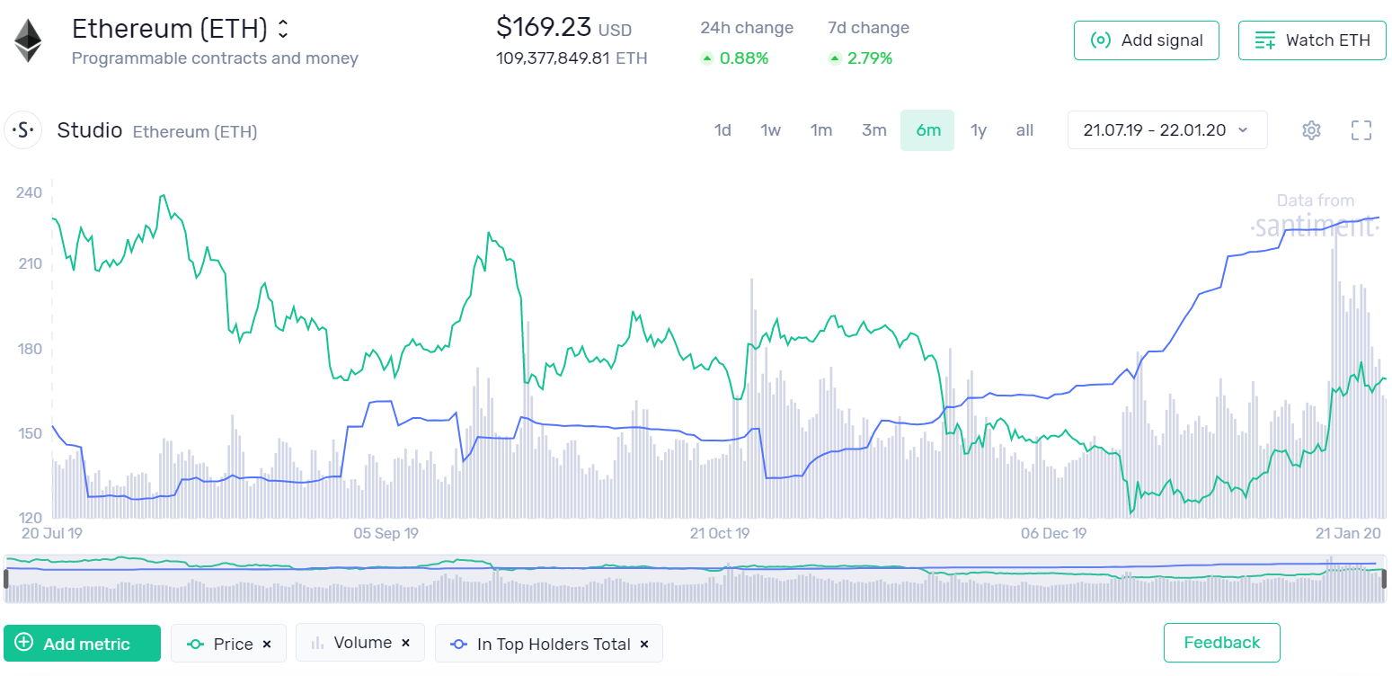
This is a snapshot of Ethereum's chart on Sanbase, as of late January. The percentage of total supply that these top holders own has rocketed from 11.3% in mid-October to 13.3% just three months later. When we're talking about two full percentage points of an asset that is worth $18.51B in market cap, 2% is in the range of $370M additional investment capital owned by the top holders in the span of 45 days or so. This is massive, and it likely means that these large capital holders were expecting a large movement in price for Ethereum. And guess what... it just happened.
Ethereum's price flush more or less drove out many smaller traders from late September, 2019 until the end of 2019. However, notice in late October when the top holders line began to rise steadily. Yes, the price continued to fall for another couple months as crypto closed out 2019 poorly. But when things bottomed out around $120, notice how sharply the top holders' bags began to rise. This is fairly clear evidence that high capital ETH investors were waiting for these prices to accumulate and add to their bags. And as of this writing, they are continuing to add on to their bags little by little, even with the price above $200 again for the first time since late September. Since whales have been involved in the rise of Ethereum's price, and it's been a much more gradual rise than, say, the huge $ICX spike that has been occuring over the past week, Ethereum is much more likely to hold or grow from these prices.
Sansheets Top Holders Model - Comparing Project Fluctuations and Measuring Top Holder Influence
Now, let's take a look at the new model we've added to our growing library of Sansheets leading indicator models. Since we often want to know how investors of assets are behaving from a token comparison standpoint, it can be tedious to go from one project page to another and not remember which tokens are gaining or losing traction with top holders. So why not put top holder behavior of multiple ERC-20 projects all on the same chart axis?

Here, we see 14 separate projects and their percentage changes of the top 10 holders' total supply of that token from a cumulative perspective, over the past 30 days. And unsurprisingly, we can see some serious variability between them. The light green, for example, representing the aforementioned REN, saw a 1.16% increase in total holdings on February 2nd. And wouldn't you know it? The following day, February 3rd, saw the project's price rise 18.6%. On the other end of the spectrum, we can see that the bottom light blue line, represented by Kyber Network Coin (KNC), had a large sell-off from January 9th to 10th. And when this happened, the project dropped 3.03% that day, despite other altcoins having positive performing days.
With this new model, you can also separate these holdings to supply on exchange vs. off:


These rises and falls can of course occur for a variety of different reasons, and it's important to understand how price relates to this. As of now, I have simplified these charts to only include one price line, arguably the one that matters the most for all of them - Bitcoin $BTC. This is reflected by the black dotted line, which is using the right axis instead of left. I've noticed that when Bitcoin's price has a sharp down movement, this can actually lead to increases in top holder supplies, because altcoins drop sharper than $BTC in a heavy majority of instances, and small traders often sell out of them at bottoms when they fall below their threshold to hang on to their bags. Who do they sell to? Those who can afford the suppressed prices, of course - the top holders.
Here is a view that isolates these same tokens to only show movements when there is a greater than 1% move in a day. Again, these are color coded, but shows as individual area charts that have connected lines when there is a consecutive day with >1% spikes following or preceding it.

Lastly, we can take a look at another view on this Sansheets model, and likely my favorite. The chart below simultaneously tracks how these ERC-20 project top 10 holders are fluctuating on a weekly comparison basis, as well as how much each respective group of top 10 holders are controlling of the total supply:

The Foreshadowing Impact of Top Holder Actions
Generally speaking, the smaller the market cap of a project is, the larger the percentage of holdings the top 10 addresses hold. Since there are fewer overall addresses typically in existence for these smaller projects, this logically makes sense. And when you compare a newer project like FET's top holders (88.1% of supply), to the 2nd largest market cap token, ETH's (13.4% of supply), it's an obvious difference in leverage each of these holders have on their respective projects. This is important to keep in mind, as if one top holder of FET decides to sell off or add on to their bags, it will likely hold much more weight on the project's market cap than the same scenario playing out for one of ETH's top holders.
Using this same view, we can actually see the weekly progression of these top holders' reigns on their project's total supply. If we were to analyze the trend happening with most of these projects on this chart, we could see a pattern in the most notable changes over the past 4 weeks:
- Dai (DAI) declined 4.61% of total supply among top 10 holders
- Enjin (ENJ) declined 2.03% of total supply among top 10 holders
- 0x (ZRX) declined 1.55% of total supply among top 10 holders
- Decentraland (MANA) declined 1.47% of total supply among top 10 holders
- Kyber Network (KNS) declined 1.21% of total supply among top 10 holders
- Augur (REP) declined 0.97% of total supply among top 10 holders
- Golem (GNT) declined 0.93% of total supply among top 10 holders
- Ren (REN) increasing 0.83% of total supply among top 10 holders
Given this is a small sample, and things could change in a hurry. But as of now, it seems that the general trend is that these top holders have been taking profit, which makes sense after a very lucrative January for the majority of crypto. And if we're seeing the whales' percentages of supply decreasing fairly uniformly, it very well could be a sign that altcoins (especially smaller ones like those notables above) are not ready to break out just yet.
Getting to know the Top Holders metrics on our platform is a good idea for all traders and investors, as they very often indicate some optimal entry and exit points. Particularly on large pumps or dumps, watch to see when these large cap investors decide it's time to empty their bags or accumulate more. You may just become a top holder yourself with enough analysis of their behaviors.