
The Art of TA Figures

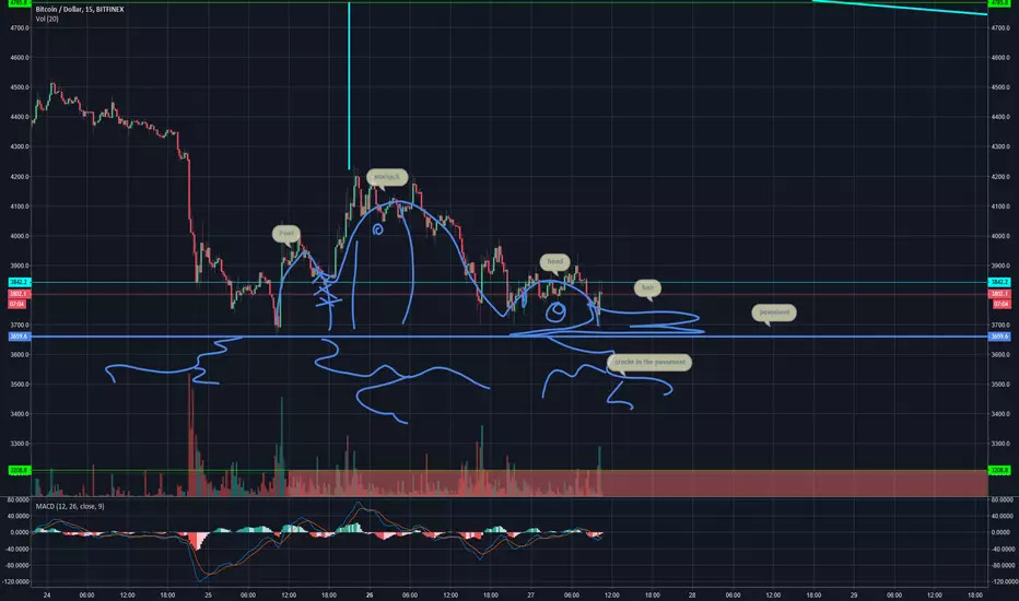
BTC
What it this figure reminding you of?
Yeah! This is a so called "Bart Pattern" on BTC price chart.
First noticed by The Crypto Dog two years ago:

Some saying a “Bart” is actually just a “common liquidity gap” being filled. Some blaming whales.
The thing is Bart is not alone!


Thanks whales, we haven't got rekt by a Marge Simpson pattern:


What's your favourite pattern?