Taking Daily Active Address Divergence vs. Price to a Simplistically Effective New Stratosphere

It can be argued that there is no greater and more accurately predictive metric in cryptocurrency than daily active addresses. The metric is defined by the Santiment Academy as "...the number of distinct addresses that participate in a transfer for a given asset in any given day... Each address is counted only once for the day. Both the senders and the receivers of the asset are counted." In other words, this metric is measuring the amount of network activity of any given asset, based on the amount of unique participating addresses. Over time, prices tend to follow DAA on a long-term time scale, given enough time for price to roughly lag behind its total address activity. Here's proof:

It's far from a perfect correlation, and that's a good thing. If BTC's market value price was perfectly baked into real-time fluctuation in active addresses, then there would be no real marketplace for it due to the lack of edge traders can have. Assets need bullish and bearish divergences to be enticing for traders to... well, trade them and feel like they're getting an edge. For those savvy enough to keep up with daily active addresses of several of their favorite assets on Santiment, as we provide the platform to easily track them as is shown for BTC, then they have likely found some nice trading opportunities to take advantage of.
However, some of our Sanbase PRO subscribers and consistent fans of our This Week in Crypto calls (Fridays at 7am PST), may be aware of our DAA vs. Price Divergence model we provide. Jan, our recently departed analyst, put together an incredibly comprehensive primer on how it works, why it works, and why it's a game changer as a back tested leading indicator. In his model, which has been upgraded to several iterations since, a 21-day rolling average was used to spot when DAA began fluctuating to outlier levels during this short, 3-week time frame. The results were quite solid, and he and myself were able to backtest it at various thresholds to see when a bullish or bearish spike was qualified.

By all means, this model works great, and we still very much recommend using it as a supplementation with your trading strategy to identify local top and bottom potential spots in the markets. However, as we can see, these spikes were only reliable for very extreme cases of DAA being far lower or higher than what a 21-day range of data expects it to be. For seldom short signals for BTC, ETH, and many other assets we have since added to be used with this model, we highly recommend our Sanbase PRO users refer to it to this day! However, we knew that something giving more consistent signals for the mid and long term trading would be advantageous.
Queue the "but there's got to be a better way" TV infomercial narrator...

For those of you who have tuned in to the last two This Week in Crypto calls hosted by Santiment, we have demonstrated the power of using a longer term time scale to identify when tops and bottoms are forming on a much more consistent basis. And we can do this without needing to remove 90% of the signals that were formerly giving inconclusive data due to not meeting threshold requirements in our first DAA vs. Price Divergence iteration.
Instead of using a rolling 21-day average, I decided to take a comparative approach that uses a sample of 1-2 years (depending on the asset) collecting daily prices and daily active addresses. By identifying the means (most middle numbers) of both of these metrics over these long-term time spans, I hypothesized that we could simply compare the percentage deviations away from each mean for each. By subtracting Bitcoin's price deviation from its 2-year mean from its same-day DAA deviation from its 2-year mean, we can conclude whether there is a positive or negative divergence compared to its expected price on any given day.
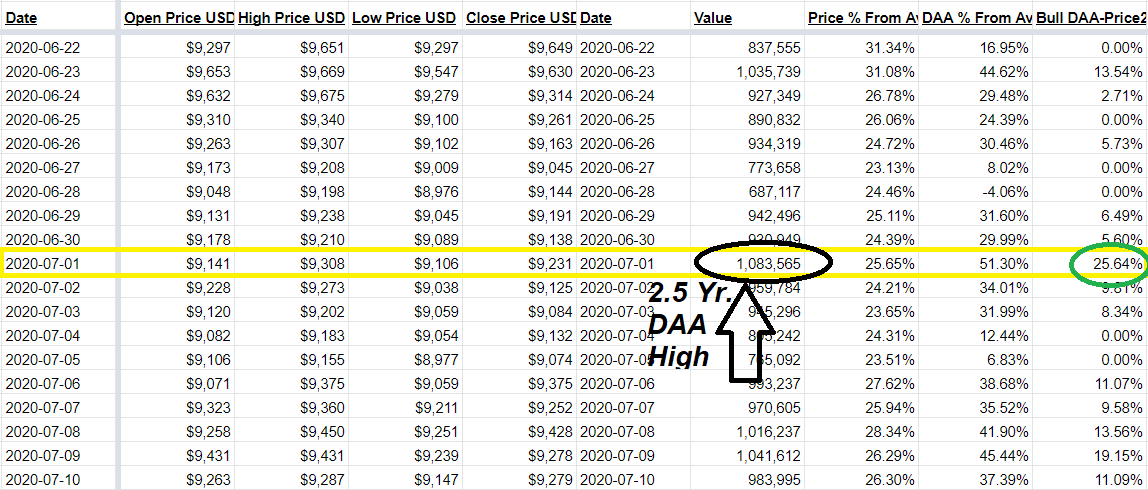
For example, On July 1, 2020, we recently saw the highest single-day level (1.08M) in Bitcoin's tracked Daily Active Addresses since the end of the 2017-18 bull run in January 2018. In the image below, we can see that the closing price this day was $9,231, compared to a closing price of $9,649 just nine days earlier and a significantly lower level of DAA that day (838k). When the DAA of an asset is actually rising, while its price is falling, this is a clear tell-tale sign that conditions for the asset's network are becoming more ripe for a price upswing.
But why haven't prices exploded after such a nice swing to the bullish divergence side of things? Well, here is where this same day appears on the DAA vs. Price 2-year chart for Bitcoin:

It was clearly the highest bullish DAA divergence signal that BTC had seen since all the way back in late April. But notice the isolated single DAA signal that appears sky-high on March 12, 2020. This was Black Thursday, where Bitcoin's price dropped a historic ~50% in a single day (at one point) following equity market and pandemic-related fears.
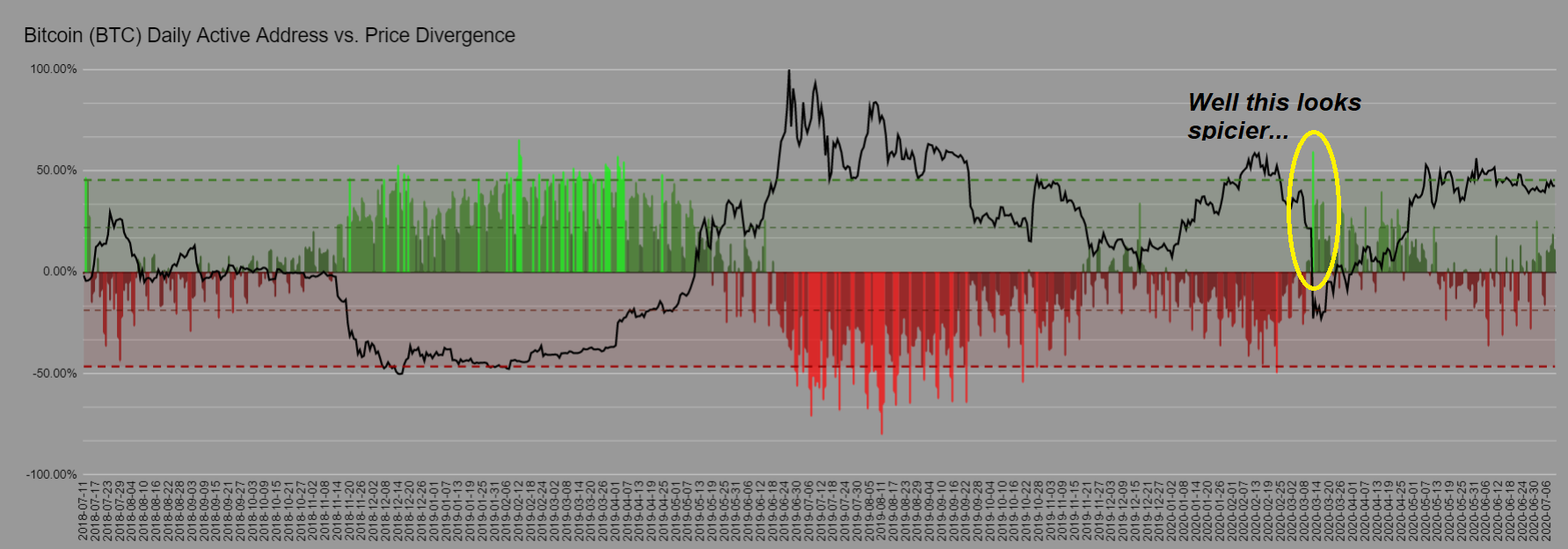
So why was this DAA divergence signal so much higher than the recent day where BTC just saw its highest level in over 900 days? Well because the price of $9,231 makes more sense for a day with 1.08M DAA, than a price that plummeted to a close of $5,018, yet still maintained a very respectable 917k DAA. The difference in July 1st's price compared to Black Thursday is +83.7% higher, while the difference in their DAA's leaves July 1st's only +17.8% higher. So price was much more affected than DAA was on Black Thursday. In fact, Black Thursday's Bitcoin daily active addresses was actually considerably higher than its surrounding days. But it still registered this massive bullish divergence spike simply because the model was indicating that BTC had no business closing at such a low price.
Of course, if this model had existed four months ago, we would have all been able to see just how clearly oversold Bitcoin was on that historic day. It was a unique circumstance, of course, due to external factors that nobody knew how to prepare for in crypto. But regardless, knowing what we know now about any time a neon green signal appears (signaling a top 10% highest bullish signal for BTC), we would have all been hammering the buy button on our respective exchanges.
And of course what really provides the definitive valuable proof of concept of this new, updated model is when we look back at both the massive cluster of bullish signals that were clearly revealing themselves back in late 2018 and early 2019 when the price of Bitcoin was bottoming out (which we now know in hindsight).

By now, you're probably wondering if this model works well for other assets by Bitcoin. And you better bet that after discovering how proficiently clear the buy and sell signals were proving to be on this model, that I wanted to find that out right away myself! Here is a look at Ethereum over time:

The first thing to notice is just how deficient daily active addresses were back in the summer of 2018 for Ethereum, back when it was leading up to (and rapidly descending from) a two-year high price of $501. Remember that this model can catch tops just as well as it can catch bottoms... particularly with neon-colored signals that signify the top 10% and bottom 10% outliers for any given asset. When the price fell all the way down to $85 back in mid-December 2018, we saw some very clear signals that DAA was proportionally exceeding the price by a wide margin. And sure enough, things bounced immediately afterward.
We saw the most significant bullish signals for ETH occur about 1-2 weeks following Black Thursday, as opposed to directly on the day like in BTC's case. Regardless, these buy signals were clearly accurate, and the divergence has remained bullish ever since. Note that most recently, we are back in ultra bullish divergence mode again in the recent two weeks after Ethereum hit an ATH in daily active addresses on June 30, 2020. Based on this model alone, it very well could be signaling a local bottom that we're in right now. But its ability to break free, even if this is the case, will be reliant on Bitcoin remaining stable. But I digress, and this is by no means investment advice!
I've also tested this model for other altcoins, and I've noticed that the ability to accurately predict divergences rests with how big the asset is. Chainlink (LINK) is the 12th ranked market cap asset at this time, and its chart had to be focused down to one year of data instead of two to get a telling story. And yes, this is still extremely accurate! Notice the one-year high bullish signal accurately predicted the price breakaway for LINK that occurred over the past week:

Looking at a lesser known ERC-20 like Golem Network Token (GNT), currently ranked 112th in market cap, does not bring nearly as accurate or impressive results on a one-year scale though. It appears that many of the outlier neon-green bullish signals appear as its price has already made its move up in many cases:

These false or lagging signals on the smaller assets are somewhat familiar on many assets that are available to Sanbase PRO members on this model. For now, I'd advise against putting much credence in using it consistently for any assets outside of the top 20 until they receive some further testing and timeframe adjustments. My theory is that market caps for projects outside of the top 20 are small enough that an extraordinarily high or low DAA day on their respective networks that prices adjust to singularly high transaction days in more real-time.
Since individuals have more power to move markets with the equivalent amount of funding that wouldn't even move the needle on BTC or ETH, there isn't as much of a time window of opportunity to react to an outlier neon green or neon red spike for an asset like GNT because prices react to them much more instantaneously. This creates little room for divergences, which is what traders like many of you have gotten this far in the article, are looking for. The purpose of this model is to find overbought and oversold opportunities, so I would advise much heavier caution in these kinds of assets until more tests are done.
With all of this being said, the advancements we have been able to achieve through creating this model can't be ignored. And I anticipate that this will be an extremely useful tool for our Sanbase PRO members to reference before making any significant mid or long-term market moves on larger cap assets like BTC, ETH, and LINK. Again, note that these are still being adjusted and refined to be optimized to perfection, so do not suddenly base all of your trades on some nice looking models you just found out about. But to say that this model could have some potentially groundbreaking leading indication potential is certainly a fair assessment!
Conversations (0)