Spotting ETH Price Tops Using Behavior and Volume Analyses

Synopsis:
- It's possible to time price tops in crypto
- Analysing the "crowd behaviour" is the way
In this article, we’ll demonstrate the same top formation for Ethereum that appears in three completely different data sources:
- Price/Volume
- Social (amount of coin mentions)
- On-chain
Here’s the set of metrics that I’ll be highlighting today, plotted against the price of ETH.
(If you want to check out these and other on-chain, social, price and development indicators for over 900 cryptocurrencies, try Sanbase Pro ($49/month) for free for two weeks by following this link.)
Let’s jump into the analysis:
Breaking Down Ethereum Volume(s)
When analysing market trends, our focus should be on a few select behavioural patterns. Not many, just a few. Less is more. Focus is power.
For the purpose of this analysis - we will focus on Ethereum volumes. Plural.
Volume is a powerful concept in finance, usually equated with trading volume in particular.
For example: strong trends are often earmarked by a rising trading volume.
Behavioural explanation: the market (the crowd) realizes that the trend has indeed come, so everyone jumps aboard the pump train.
A fading trend, on the other hand, usually manifests with a “divergence" between the price (still growing) and trading volume (no longer following the price)
Behavioural explanation: everyone is "in", can't pull in new money anymore. No new money - end of the game, music stops playing.
Please note: this occurs often, but not always. Some tops will still exhibit their explosive (not fading) nature.
Now, here’s what’s so cool about the crypto market in general and the Santiment platform in particular:
At Santiment, we don’t just account for the coin’s trading volume - we also calculate its total social volume (amount of coin mentions on crypto social media) as well as its on-chain volume - a concept endemic to cryptoassets.
These multiple, critical layers of trend recognition allow us to analyze and identify clear top formations in all digital assets.
So, once again the following:
- trading volume
- social volume (# of coin mentions on crypto social media - developed by Santiment)
- on-chain volume
are keys to deep, yet relatively simple behavioural analyses of the crypto market and any specific coin.
Note: there are several ways to define and measure on-chain volume. In this post, we’re using the amount of daily active addresses that interacted with the coin as proxy for on-chain volume.
Let's have a look at all three volume metrics for Ethereum, and how they ‘behaved’ during the token’s July 2019 top:


The same top pattern holds up across the board. As long as the price keeps growing on the growing volume (healthy zone), the trend will likely continue. Once we see clear signs of price-volume divergence (unhealthy zone), you should be aware - the top is near.
A few notes on this:
- Trading volume spiked one last time in the unhealthy zone before plummeting
- Social volume also tried for another push, but failed
- On-chain volume was in constant decline ever since June 2nd
Fast forward to now - what do Ethereum’s volume charts say?
Look for yourself. Here’s a link to the entire setup once again (with one extra chart as a bonus. Feel free to ask me questions about its meaning and use case in the comment section).
This time, let’s zoom in on the last 3 months:
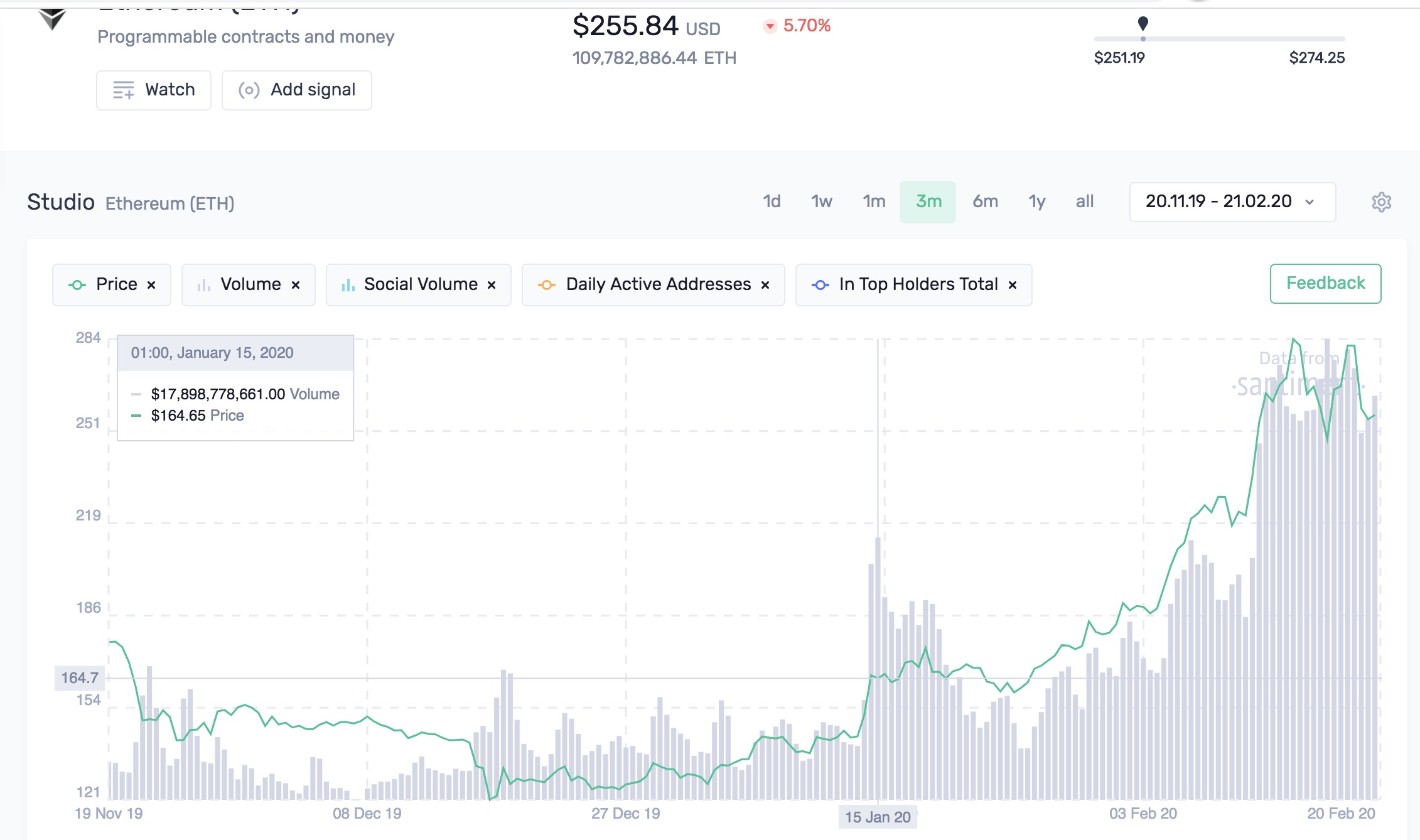


As you can see, the same pattern is starting to repeat once again. The following occurred on February 14th (the current top):
- one volume metric - social - made a new high (during the July 2019 top, that was trading volume)
- another metric (trading volume) tried, but failed
- on-chain volume (the same as during the previous top) started to diverge a few days before the top was made
So what did we learn?
- you should observe a complete set of volume metrics - trading, social and on-chain volume - to validate your findings from multiple angles
- once all volume metrics start to exhibit "toppish" behaviour - reduce (or exit) your long position
Whether you reduce or exit your position should depend on your trading and portfolio management strategy. In other words, ask yourself:
- What are your risk parameters?
- What’s your investment horizon?
P.S. This is just a small snippet of crypto data and market metrics that we’ve developed at Santiment. If you want to check out these and other on-chain, social, price and development indicators for 900 cryptocurrencies, try Sanbase Pro ($49/month) free for two weeks by following this link.
If you have any questions or ideas on what we should cover next, let me know in the comments below!
Conversations (0)