Santiment's New Exchange Inflow/Outflow Sansheets Model Instantly Compares Local Bottom & Top Opportunities for 40+ Assets All in One Chart

A brand new Sansheets model has made its debut, and it's a big one. You can now instantly compare which assets are seeing the highest (or lowest) exchange inflow and outflow spikes by simply plugging in your Sanbase PRO API!
Our new Exchange Inflow/Outflow model will automatically measure what the divergence is from the norm for exchange inflows and outflows, all on one convenient graph to quickly contrast and compare the best opportunities. Additionally, you can simply see which assets have gotten its largest exchange flow spikes over the past 90 days.
Generally speaking, an asset that reveals a high exchange inflow is one that has a higher chance than normal of seeing an imminent local top. If the exchange inflow is showing lower than normal, the asset is relatively safer than usual from a big sell-off.
On the flip side, if an asset has a high exchange outflow, this is generally a bullish sign, and can indicate that tokens are moving to hard or staking wallets for safe keeping, which is an indication of confidence. A low exchange outflow means that tokens are staying put on exchanges more than usual, and could be a sign of stagnancy or trader fear.
Part 1: Identifying Exchange Flow Divergences
Let's take a look at how these charts on this model look!


When browsing this new model, you'll see that green and red bars are measuring the exchange flow percentage difference from the average norm of any respective asset's exchange flow from the past 90 days. So if an asset's average normal daily exchange inflow over the past 90 days is 100,000 tokens/day, and the most recent full day had an exchange inflow of 200,000 tokens moved, then that asset will show a "100%", indicating there was a 100% gain from the 90-day mean in the most recent day.
You'll see convenient data labels to show just what this percentage divergence was from the norm for each asset over the previous day. And there's even a much smaller data label in green or red for each asset, which resembles what that 7-day average divergence was, to reveal whether there has been a longer trend for high or low exchange inflow/outflow.
Intuitively, you'll see that the higher the inflow, the more bearish it is for the asset, which is why the highest divergences from the norm are highlighted in red.
On the opposite end of the spectrum, the exchange outflow chart highlights the highest recent exchange outflow spikes in green.
You may also notice the thin blue columns overlapping the wider green and red inflow/outflow bars. These are the 1-day and 7-day price percent changes for each asset. You may find some ideal opportunities when one asset has had a major recent rise in price, but today's exchange inflow is abnormally high. This will generally be one of the best setups to identify in terms of seeing an upcoming local top forming.
Part II: Identifying Outlier Spikes
In case all of the numbers for each asset are overwhelming, and you simply don't care about a very mildly divergent exchange inflow or outflow for most assets on any given day, you can also look at charts that ONLY look at major spikes.
Below are charts that highlight each asset's three largest exchange inflow spikes and three largest exchange outflow spikes on their respective charts:

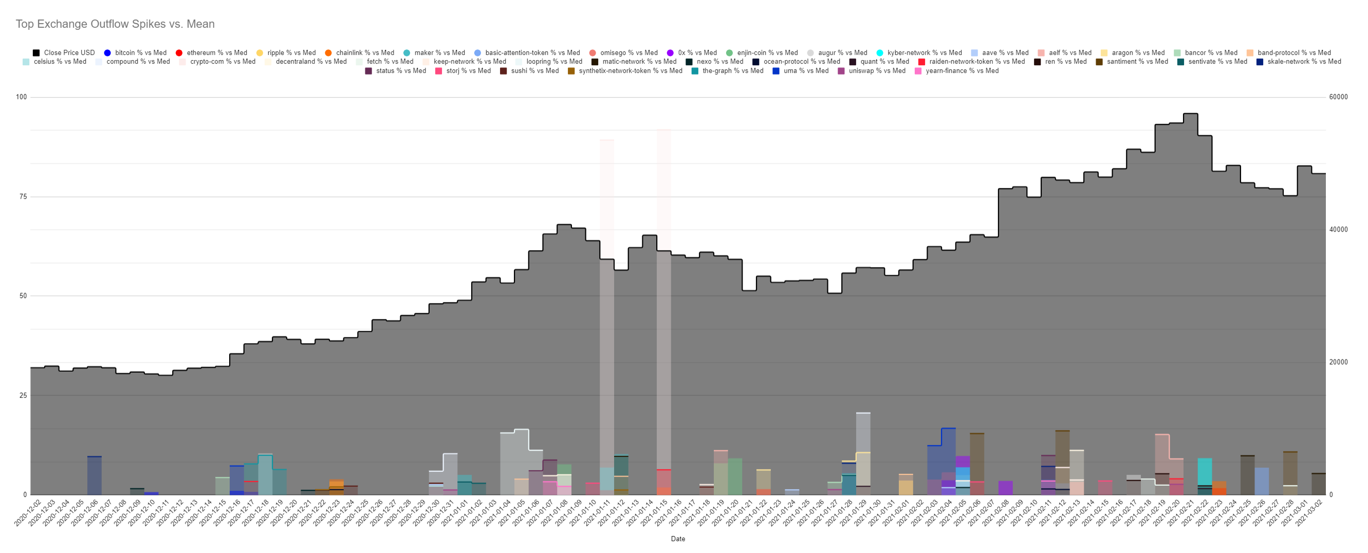
With 40 assets being shown simultaneously, this model is pre-programmed to show a total of 120 spikes that resemble the days in which each asset had one of its three largest inflow (or outflow) spikes in the last 90 days.
This view gives more of a simplified perspective on which assets on a given day are seeing major exchange activity with tokens flowing in or out of them.
If the amount of different colored shades seems daunting, don't worry... When you're actually using the model, it's as simple as hovering over the bar with your mouse, and the asset that is matching in the legend will show up for you as a tool-tip with the proper label. The label also reveals the percentage that particular spike was above the mean for that day. hence the various heights of the spikes.
You'll notice that several days have multiple assets that had one of its top three spikes on that day, so the bars are transparent to show overlapping bars, each of which you can highlight to reveal which asset it is.
And if the top 3 spikes for each asset are a bit too frequent or too rare, you can actually go into the Inflow Data or Outflow Data outflow tab on the model, and you can switch the number of outlier spikes you want to see on these above charts, just by changing the digit in this one cell!

And yes, you can also change the assets that you want to look at themselves. If you don't want to view 40 coins simultaneously and just want your favorite three, simply delete the cells in row 1 that show use the asset slug to compile data. Or modify the slug to match the asset you want the model to compile exchange flow data, and it will instantly pull the metrics for that coin you chose instead.

All in all, our latest Sansheets model should make it significantly easier for our amazing Santiment community to identify major exchange flows for many assets all at once. The customizability of it is quite endless, and we encourage you to explore it!
If you have been considering getting Sanbase PRO, this and several of our other Sansheets model are a $45/month subscription away from activating.
For links to all Sansheets models we've made, they are freely available to download for our Sanbase PRO users so they have their own personal model they can update and track any time. By default, these will not work until you sign into it using your Sansheets PRO email address. So if you only have free access on Santiment, it's now a great time to get access and enjoy the full power of our leading price indicators and powerful asset analysis using our best predictive metrics. If you don't yet have a PRO account, upgrade here!
Once you have your Sanbase PRO account (or if you already do), you'll then want to check out any of the model links below and go to File -> Make a Copy, and simply:
1) Download Sansheets: https://academy.santiment.net/sansheets/setting-up/
2) Plug in your API: https://academy.santiment.net/sansheets/adding-an-api-key/-----
3) If you're having trouble getting the data to load on a model, head to the 'Data' tab on the far right of the spreadsheet, and go to the yellow cell. Then delete the cell formula, then hit Undo. This should manually refresh the data.
Disclaimer: The opinions expressed in the post are for general informational purposes only and are not intended to provide specific advice or recommendations for any individual or on any specific security or investment product.
Conversations (0)