
Quick Update for you Folks

The carnage we have all experienced may seem mentally defeating, but it is through challenging times that we develop the ability to reach higher levels of cognition. Learn from your mistakes and ensure you do adequate research when investing into cryptocurrencies.
Lets get to the graphs.
There has been a noticeable uptick in speculators/investors looking for value purchases of BTC at these levels.
We can identify value zones by looking at the historical levels of Bitcoin falling below the cost basis of short term holders displayed in the graph (Figure 2.0).

In aggregate, times when investors were realizing losses at this pace has not been seen since the last 2 years of data. Figure 3.0

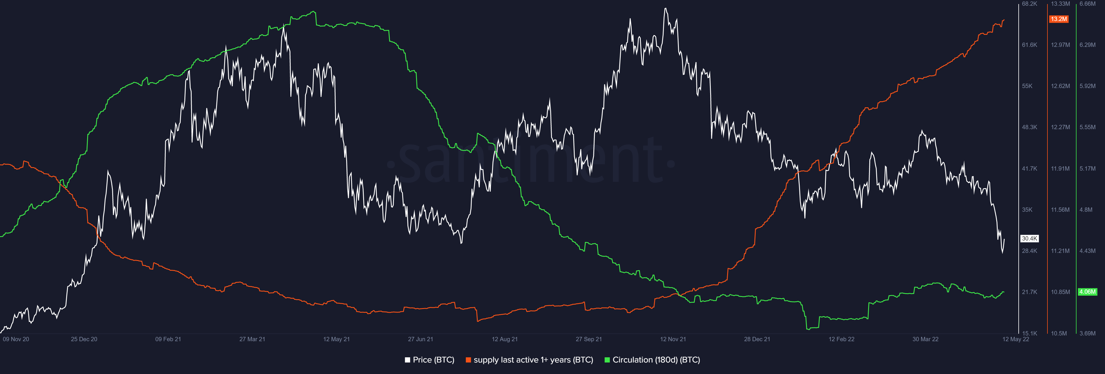
We can assess which cohort is moving their coin out of dormancy figure 4.0 below and selling at these levels of loss. You can quantify the economic value of losses by looking at realized cap/value. In the graphs below we will dive into which addresses are moving their coin by factoring in time held.

As presented in the graph below - figure 5.0 (Short-term Cohort in aggregate [green] vs Long-Term holder cohort) We can identify in aggregate which address were moving their coin out of dormancy.
Some Holder Statistics
New holders have shown up for their premium buys - at a rate 69% higher than the last months and 58% higher than a year ago today. However, most of the groups have declined in holdings as depicted by the red arrows in figure 7.0 -Other than the longer term holders which have accumulated and held.
The 1 month change in 7.0 demonstrates the amount of holders which have capitulated in the last month, since we are mostly in the negative zone. Given that our short term cost basis (realized cap) has sat in a unprofitable range for the majority of the year, we can get a take on which cohort is realizing at a loss.

You can find additional mean reversion tactics on a short thread I posted on Twitter. The post provides information on price relation to moving averages (200d Ma, 50d EMA).
https://twitter.com/Daily__Dopamine/status/1523670465775947777?s=20&t=tZLWef4mY3mAtu-EpEkz3w

Follow me on twitter for more!
NeuroInvest
@Daily__Dopamine