Analyzing Markets to Predict Asset Network Health, Using XRP

One of the most difficult steps for new crypto traders to make is figuring out exactly where to start. With tens of thousands of accepted strategies out there that claim they can help you make informed portfolio decisions, which ones are truly viable?
Well, Santiment has many metrics and indicators available that can help traders navigate the markets in a way that is easy to digest. Today, we will be looking at some of our best tools through the lens of XRP, a popular asset that is coming off of a very positive July.
Let's break down these metrics and indicators, one at a time:
Utility Metrics:
Transaction Volume (in USD):
To kick things off, let's understand what it means when we look at an asset's transaction volume (translated into dollar value). Simply put, we are measuring the amount of coins being moved during a particular time interval, and then multiplying it by its then USD price. If 1,000 XRP is moved at this very second at its current value of ~$0.68, this would be $680 of XRP on-chain transaction volume. If we go back to a point in time where XRP's price was ~$0.34, it would take 2,000 XRP to be moved to match that same $680 in on-chain transaction volume. This metric is a great way to have a glimpse at just how much total true value is being moved during a given few minutes, hours, days, or weeks.

Using Transaction Volume (in USD) to Predict Markets:
Transaction Volume spikes can be used to identify when prices directions may be gaining support. If a rise in price is followed by a transaction volume, it can often be a validation that the market rally is not quite over. Understand, however, that the same can be true if a spike is happening while prices are on their way down.
Token Circulation:
Token circulation measures the amount of unique tokens that are being moved during any given timeframe. We stress the word unique because any token being moved is only counted once during that timeframe. So if you're looking to see how many total XRP have been moved in a particular day, understand that a token that has been wash traded or moved around to multiple addresses for whatever reason, will only be counted a grand total of once. This is, in Santiment's opinion, a superior way to measure the true activity of a network, as it intentionally cancels out the market manipulation effect or irrelevant transfers that aren't providing true reflections of the network's real activity levels.

Further, Santiment has a model to measure how this token circulation actually measures up against the asset's current market cap level of the asset. This comparison of circulation vs. market cap (or price) is known as NVT, with NVT standing for Network Value to Transactions Ratio. The model is long-term, and is intended to study the health of the network on a monthly basis rather than a daily one.

Using Circulation to Predict Markets:
In regard to measuring circulation on its own, there are two ways of using this metric to predict future market movement. When you see an anomolous spike that is far above the trend of other data points, this is an indicator that suggests a price direction shift has a high probability. If there is more of a gradual rise or gradual fall (particularly on long-term timeframes), this is more of a signal that we may be entering into a bull market (if rising) and bear market (if falling), respectively.
And in regard to the NVT model, green and yellow-green bars mean that there is an abundant amount of circulation on the network, which suggests a higher likelihood of a future market cap rise. Red and orange bars mean there is a lack of circulation to justify market caps staying as high as they currently are, and this indicates a higher likelihood of a future drop.
Address Activity:
Address activity works somewhat similarly to token circulation, and can best be analyzed in tandem with it. Instead of measuring the amount of unique tokens being moved, this metric looking at the amount of unique addresses that are interacting on the network at any given time. Whether the wallet makes 50 transactions or 1 transaction in a single day, for example, this metric will simply register the address as 1 of the many addresses when tallying up the total amount that were active.

Using Address Activity to Predict Markets: Address activity, based on what we've seen, is a bit more of a long-term alpha indicator compared to many of Santiment's other leading indicators. Look for long, sustained climbs in the amount of addresses interacting on a network, particularly when market caps are growing. It can be great validation for a bullish rally to continue, when it's supported by address activity rises. But if prices are rising without that activity growth, it can be likely that the price rally will be short-lived.
Trading Volume:
Trading volume esse This is already a very commonly accepted and known metric in technical analyst trading circles. This metric represents the number of coins that are being traded during a certain time period. It can be great for confirming whether a trend in the markets will continue, or to visualize the momentum of an asset's recent direction.

Using Trading Volume to Predict Markets: High amounts of trading volume may show an increase in interest, but it doesn't necessarily mean that the interest rise will translate to increased rises. This is more of a validator and lagging metric, which can be used to confirm that a price swing that has already happened, will continue or not. The rule of thumb with volume is that gradually rising volume into whichever direction prices are moving greatly increases that price direction to continue. Think of rising volume as added 'fuel' to make the vehicle moving in a specific direction 'stay on the gas'. However, if prices are rising, but you're seeing volume dropping, it greatly increases the likelihood that the price movement will soon come to a halt and even switch directions.
Trader Sentiment:
Social Volume & Dominance:
Getting into some of our social metrics now, we can start by looking at the raw amount of mentions in a given asset, known as social volume. Simply put, if you want to know how often traders on public social platforms are talking about 'XRP', 'XRPNetwork', 'Ripple', or other similar associated words, you can simply open up the asset's social volume and see when it's getting an increasing or decreasing amount of attention.
And social dominance, which works similarly to social volume, measures the amount of mentions of the asset and measures it in relation to the totality of mentions of all top 100 market cap assets. This is extremely helpful in not just seeing raw mentions during a dull time of the day, but instead measure how an asset like XRP is being mentioned as a percentage of all notable mentions about assets at any given time.

Using Social Volume & Dominance to Predict Markets:
Social dominance is really the metric that we recommend focusing on to find alpha on where prices will head next. When there is a sudden rise in frequency of the current discussion rates toward the specific asset you're looking at, the reason is usually related to a sudden price shift that traders are paying increased attention to. And the larger the spike in social dominance is compared to its normal resting rate, the more chance that this price direction will be coming to a screeching halt.
The reason is that prices typically move in the direction that is least expected by the crowd. And if the mainstream crowd is hopping on and recognizing a pump is commencing, the 'FOMO'ers are essentially giving the whales and sharks the best prices possible to sell and suddenly push prices down. There will often be a short delay between an asset's social dominance spiking, and the price reacting to the increased mainstream interest. Therefore making this a great leading indicator for swing traders.
MVRV:
It may seem like your Telegram or Discord group is all on the bullish side together all the time. But crypto is a zero sum game just like any other trading sector. And average trading returns are vitally important to keep tabs on when deciding on what precise time to enter or add on to your position. And MVRV, short for 'Market Value to Realized Value' helps calculate whether you really are buying low and selling high, based on how your action would stand vs. the average trading positions on the network at any given time.

Using MVRV to Predict Markets:
We like to recommend looking at one shorter term timeframe (like 30d average returns) and one longer term timeframe (like 365d average returns). Historically, the higher above 0% each of these lines are, the more likely you will coming in to an asset at a risky time. Conversely, if you are coming in when both the shorter term and longer term traders are under water (well below 0%), these times can align well with a time that the asset is undervalued and ripe to suggest buys.
Funding Rates:
Instead of waiting to see what your favorite crypto influencers are saying about the state of crypto markets, it can be wise to simply look at whether people are 'putting their money where their mouth is'. Exchanges are obligated to provide their perpetual contract funding rate data, and the information that is disclosed can be used as a free lens to identify whether traders are becoming greedy (via many long bets) or fearful (via many short bets). Historically, if a heavily shorted asset suddenly gets some price rises, those shorters are at risk of being liquidated. And liquidations can act as rocket fuel for an asset to rise.
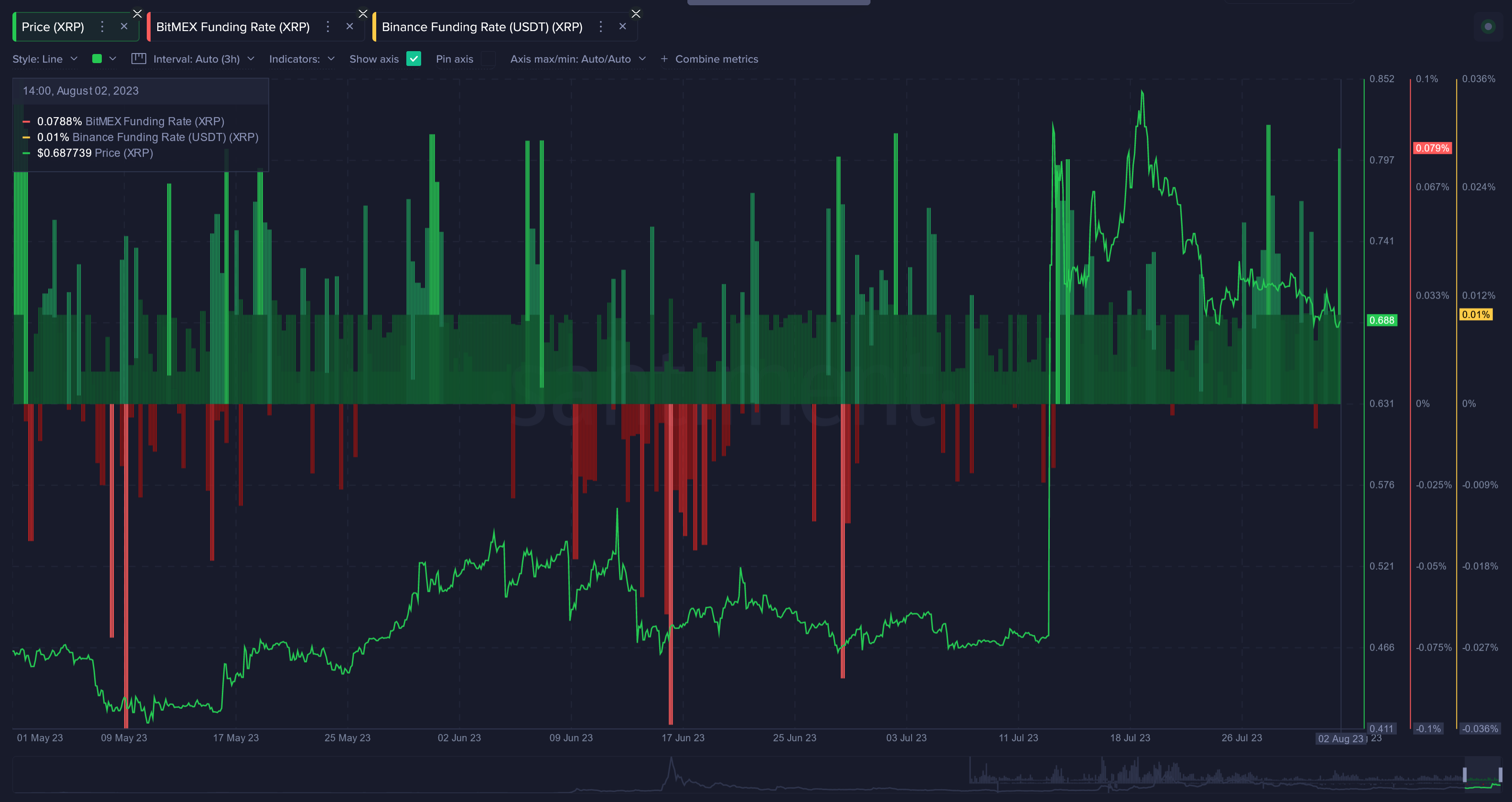
Using Funding Rates to Predict Markets:
Funding rate data is a prime counter indicator that can be very useful when deciding to buy or sell an asset. As mentioned above, investing in assets that are seeing major shorts is never a bad strategy (barring the asset is fundamentally ok), considering the fact that short bets can simply add on to your returns if liquidated. On the other end of the spectrum, tread carefully when investing in an asset that is already being heavily longed. Trade with the understanding that prices are consistently fighting to nullify extreme funding rates in either direction, and will pull them up and down accordingly.
Whale Behavior:
Whale Transactions:
Followers of Santiment's content should be well aware by now that crypto markets will always be a 'whale's playground'. In other words, big players move markets. And if you aren't moving at least hundreds of thousands of dollars (or more realistically millions) of a given asset at a time, you likely aren't causing too many waves in an asset's market cap.
But we have the information to tell you when others are. The number of $100K+ transactions and $1M+ transactions can be extremely eye opening and indicative of when a sudden price pump may be incoming. At the same time, this metric could also foreshadow a correction is about to catch many traders off guard. Except for you, of course.

Using Whale Transactions to Predict Markets:
Whale transaction data is most useful when prices are becoming volatile. If you see big whale numbers when prices have been falling, you may have just spotted some accumulation efforts by these key stakeholders. On the other end, watch out if these spikes happen while prices are rising, as this may be reflecting a dump. In other words, if prices look relatively low, it's more than likely that buying is the right move. And in the opposite scenario, selling is. Reflecting what whales do, if you're quick enough to do so when they do, is almost always a viable strategy.
Number of Addresses By Wallet Size:
And another way of looking at whale behavior is seeing how many actual existing addresses there are by size. A common misconception is that many new tiny addresses popping up on an asset's network must be indicative of the asset getting ready to expand. In reality, it's the large address numbers that you want to see grow.

Using Number of Addresses to Predict Markets:
Ideally, you want to buy when small addresses are shrinking in number (showing little confidence) and large addresses are growing in number (showing great confidence). Counter trade the small traders and fall in line with the bigger ones.
Ratio of Supply Held By Wallet Size:
Alternatively to measuring the total amount of wallets by size, you can also look at the supply held by any tier. This will cut through any deception where some wallets may be shrinking, but perhaps two mid-sized wallets are just consolidating into one larger one.
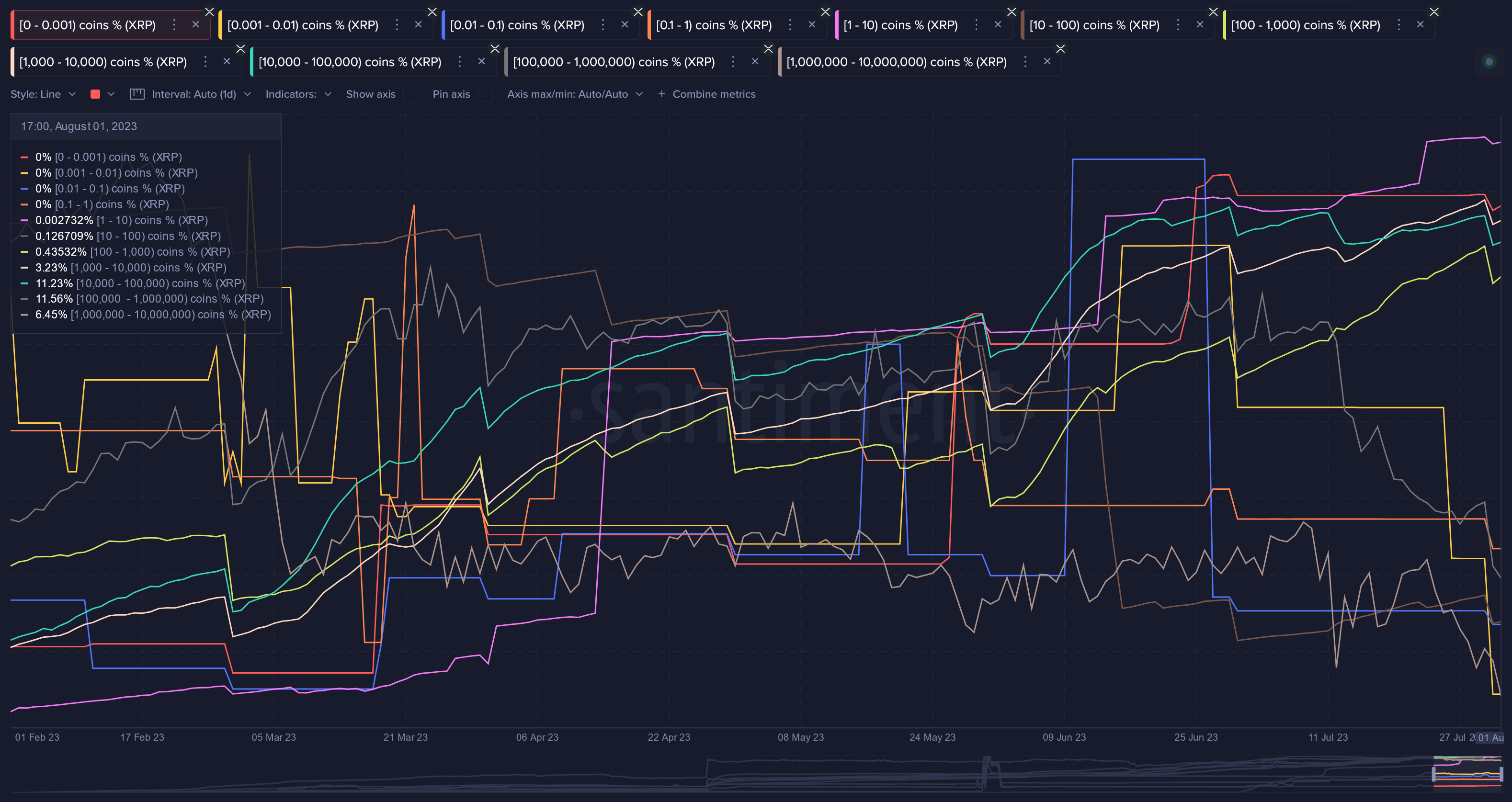
Using Ratio of Supply to Predict Markets:
Just like measuring the amount of addresses, seeing whether the supply is distributing to larger addresses and away from the smaller ones is key. If you see this scenario play out, the probability is high that market cap rises are coming in the near future. If you see the opposite scenario play out, run for the hills.
Dormant Movement:
Mean Dollar Invested Age:
A highly underrated metric at Santiment, Mean Dollar Invested Age measures the average amount of time that each invested dollar in an asset has remained in the same address where it was initially invested to. Why is this important? Well, in general, movement and activity for an asset is what helps propel the market cap higher. Stagnant coins that stay stationary in the same addresses have the opposite effect. In the example of XRP, it has unsurprisingly seen quite a bit of dormant coin movement, which has caused its mean dollar invested age line to have several dips over the past three months in particular.
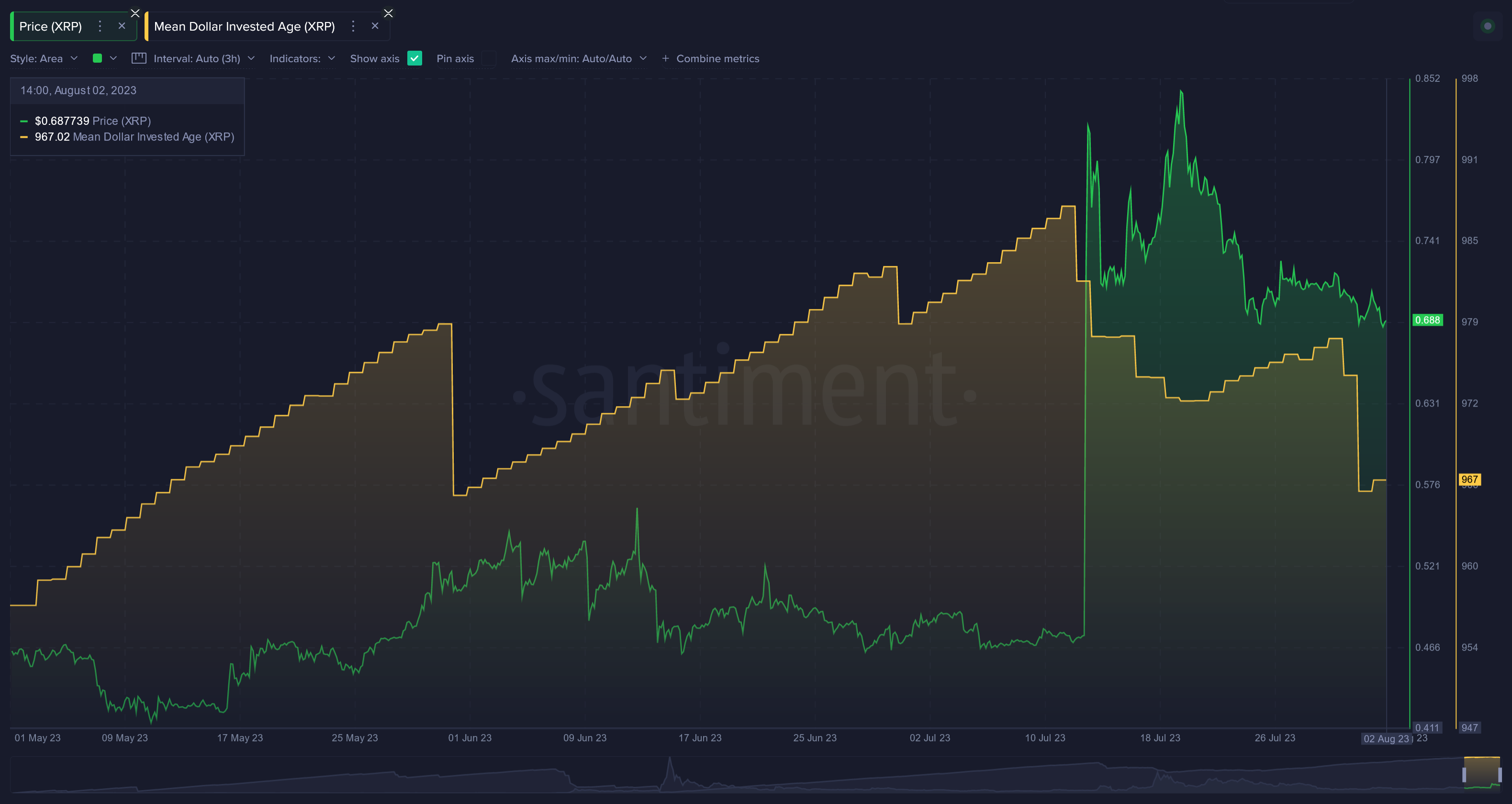
Using Mean Dollar Invested Age to Predict Markets:
This metric tends to have some minor leading indication properties, and validator/lagging properties as well. If prices are flat and you begin to see the asset's mean dollar invested age line drop, this is a sign that old coins are finally being moved and a breakout is exponentially more likely. If the asset already goes through a huge price surge, and then the mean dollar invested age line drops, this is a sign that the trend could continue thanks to the added boost from big addresses finally moving their coins and adding them back into circulation.
Token Age Consumed:
Age Consumed will reveal the amount of tokens changing addresses on a certain date, multiplied by the time since they last moved. This is similar to mean dollar invested age in that it puts a precedent on older tokens. But many prefer this metric because it takes this information one step further to look at just how old these tokens were. Spikes on the graph signal a large amount of tokens moving after being idle for an extended period of time.

This metric is a classic price direction change predictor. Particularly in cases where you see bunches of age consumed spikes as opposed to just one isolated one, this can be a great sign of a bottom signal.
Development:
Development Activity:
One of the metrics that Santiment is known for best, development activity looks directly into an asset's github to see just how much activity is going on with the team behind the project. If a team truly cares about their coin, you'll often see consistent and rising activity over time. And to avoid simply giving a raw github number, which is often misleading and diluted with routing submissions from the team that don't actually indicate development, Santiment has our own more accurate and proprietary way of calculating the effectiveness and effort level of these teams. You can read more about it in this great article.

Using Development Activity to Predict Markets:
This is not much of a short-term or even mid-term indicator. Development activity can best be used as a validation that the asset you are investing your hard earned money in is NOT a planned rug pull. Coders working on improving and innovating the coin is a strong sign that the intention is for it to actually grow its market cap... not simply make the team a quick buck. Look for gradually rising development activity as months and years elapse for the asset.
Contributors Count:
The Development Activity Contributors Count metric shows the unique number of people (represented as Github accounts) that have contributed to the public repositories of a project. Only those events that constitute 'pure' development work are taken into consideration. This is essentially an alternate way of looking at development activity, through the sheer number of unique people working on the project.
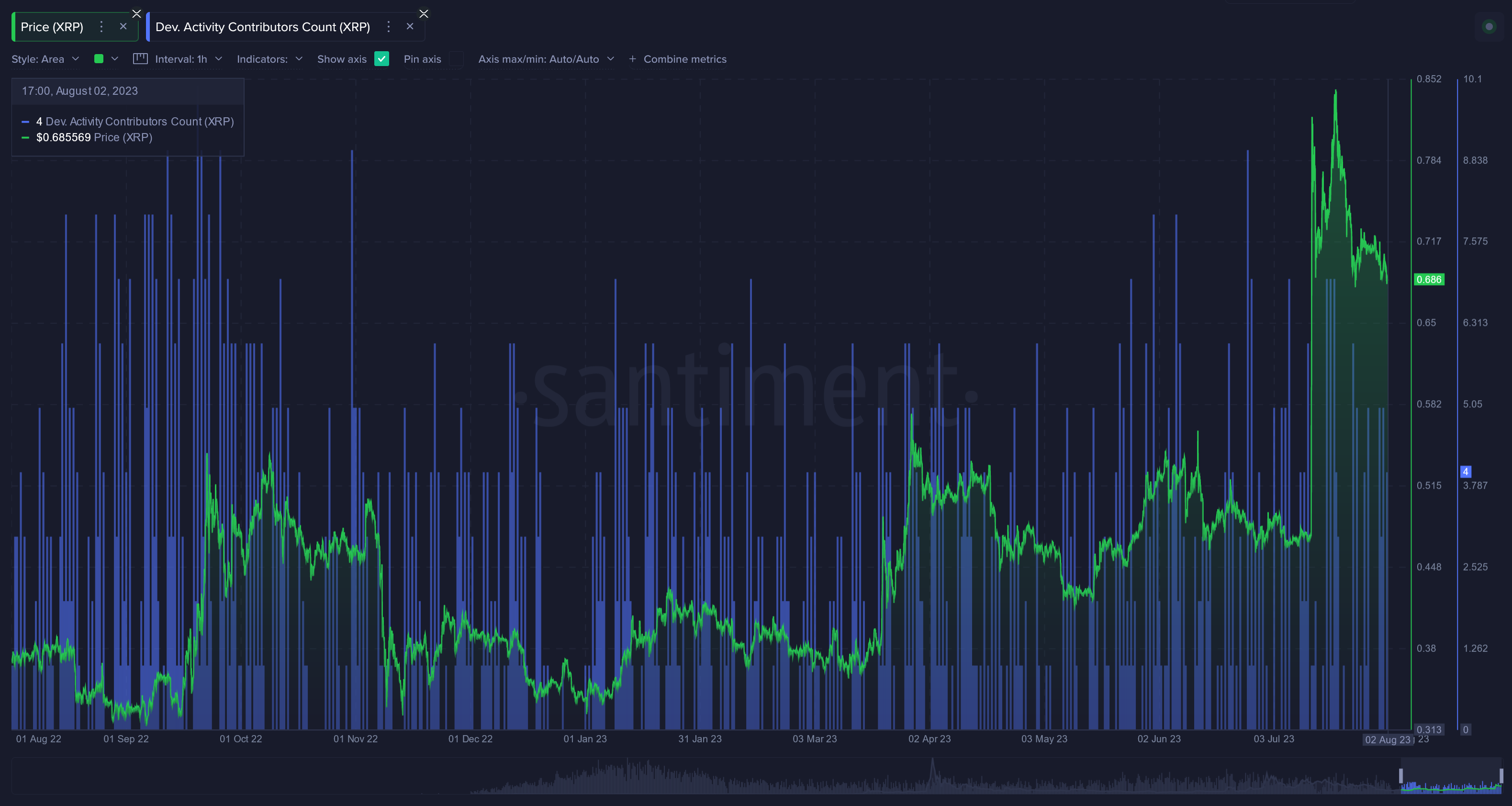
Using Contributors Count to Predict Markets:
This metric can work well in tandem with the normal development activity metric. Again, this is not a short-term signal by any stretch. You are looking for assets that see a rising amount of both overall contributors, as well as overall github submissions per day. If they rise over time, you can comfortably know that you're investing in an asset that likely has good intentions to have a brighter future. In an unpredictable landscape like crypto, there is a ton of value in knowing this to be true about any asset in your portfolio.
Additional Metrics:
Net Number of Accounts (Network Growth):
The amount of newly created wallets during a given time can be very helpful in understanding the expansion rate of an asset. Network growth leads to more circulation. And more tokens being circulated can lead to higher usage and increased market cap.
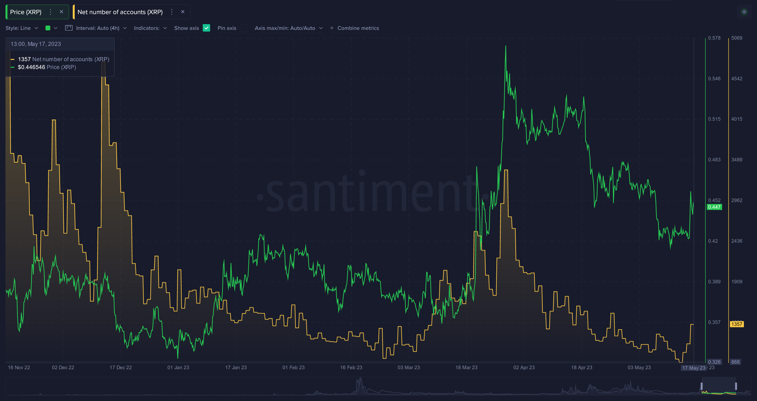
Using Net Number of Accounts (Network Growth) to Predict Markets:
It may sound counterintuitive, but a sudden spike in new addresses created is actually a sign that FOMO is potentially taking temporarily hold of the project. You'll very often see this FOMO occur as prices are surging, of course. And similar to social dominance, this is the kind of spike that should set off alarm bells for you to take some temporary profit. On the other hand, like address activity, a gradual growth in net number of accounts is a sign that the asset really is showing potential to increase its long-term circulation.
XRP Specific Metrics:
XRPL Number of Transactions:
If you are a fan of XRP and wish to study and understand the network, you're welcome to visit Santiment's Special XRP Metrics Dashboard, which has plenty of metrics all in one place.

You can analyze plenty of special metrics for XRP all in one spot, several of them independent from the metrics discussed earlier in this article. Discover information pertaining to the:
- Number of Recent Active Accounts - 30 or 90 days (Great for analyzing long-term growth)
- XRP Ledger (XRPL) number of transactions (Helpful to get an idea of the activity from the entire ledger, as opposed to just XRP transactions in particular)
- XRPL DEX Volume in XRP or USD (Provides information related to the amount of volume specifically happening on decentralized exchanges for a more granular understanding of the asset's health)
- Number of Accounts With Minimal Reserves (See how many accounts are of the minimal reserve variety to see how reserves segregate and consolidate over time)
- Number of Trustlines (Identify the accounts that have set up trustlines on XRPL to understand how this specific feature is being utilized)
-----
Disclaimer: The opinions expressed in the post are for general informational purposes only and are not intended to provide specific advice or recommendations for any individual or on any specific security or investment product.