All Aboard the Dogercoaster?

In a move that even Elon Musk critics weren't quite expecting, his new prized social platform has changed its 15+ year-old Twitter logo to a Dogecoin logo.

Crypto Twitter predictably had polarizing opinions. Most know by now that when Elon does something on Twitter, it's usually for the purpose of getting laughs, attention, or money. Perhaps in this case, all three were achieved.

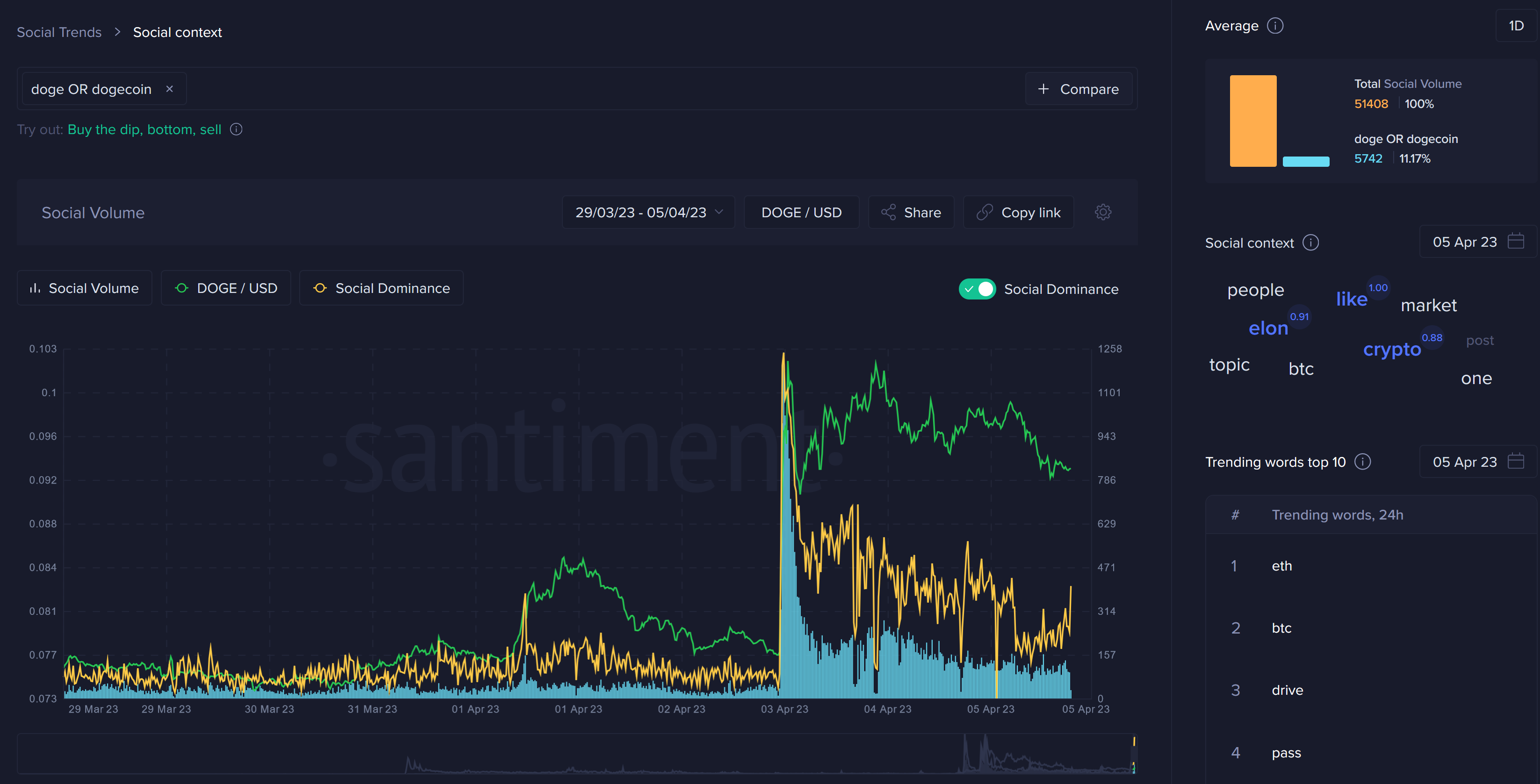
Over the next day, after this change, Dogecoin went on a +33% pump out of the blue, decoupling from the rest of crypto temporarily.
We can see how the discussion rates for the 8th largest market cap asset absolutely exploded as the Dogecoin logo made its appearance on Twitter, its big price pump concluded almost instantly afterwards, followed by a second surge as the crowd cooled off about the inorganic pump.

But like any asset, no matter how meme-ified, we can still take things away from this and analyze what exactly is going on now that prices have calmed down a bit and $DOGE has corrected back -9% from its shocking surge.
For starters, we can see plenty of top signals that indicated precisely when major players (who likely knew about the planned DOGE pump) were getting out of the asset or at least taking heavy profit.
Active Addresses & Circulation:

Trading Volume and Transaction Volume:

Whale Transactions ($100k+):

When these three metrics all spike together during a time when the asset is going on a decoupled surge independent from the rest of the markets, it's a pretty solid bet that a local top is nearly always forming here, and profit taking yourself is a wise decision.
As for average trading returns, we can see that the 30-day MVRV is sitting at +11%. Typically when altcoins hit +20% or more, this is a "danger zone". Considering it didn't quite get that high, even with the massive Elon-induced price surge, there could still be some extra cushion for prices to rise further.

But can DOGE rally even further? This chart divides DOGE addresses into four different key sizes:
- Fish (0-10 DOGE): Blue line
- Dolphins (10-10K DOGE): Yellow line
- Sharks (10K-10M, DOGE): Red line
- Whales (10M or More DOGE): Orange line

We can clearly see that the smallest fish addresses (blue line) really bought in aggressively right as the price was peaking. This is typical, and is one of the price indications of a price top.
The dolphins (yellow line) didn't really show any signs of engaging with the rally, and have continued to decline as it's done for about the past six weeks.
The sharks (orange line) are behaving the same way as dolphins, and aren't showing signs of positive upward movement.
And finally, the whales (red line) seemed to have been showing sominterest in very mild accumulation leading up to Elon's DOGE logo replacement on Twitter. It was likely something was known by massive DOGE holders, eg. people close to him, and of course Elon himself. This is just speculation, of course, without knowing the identities of the owners of these addresses.
And once the Dogecoin price spike happened, you can see how the red line did dump, indicating profits being taken.
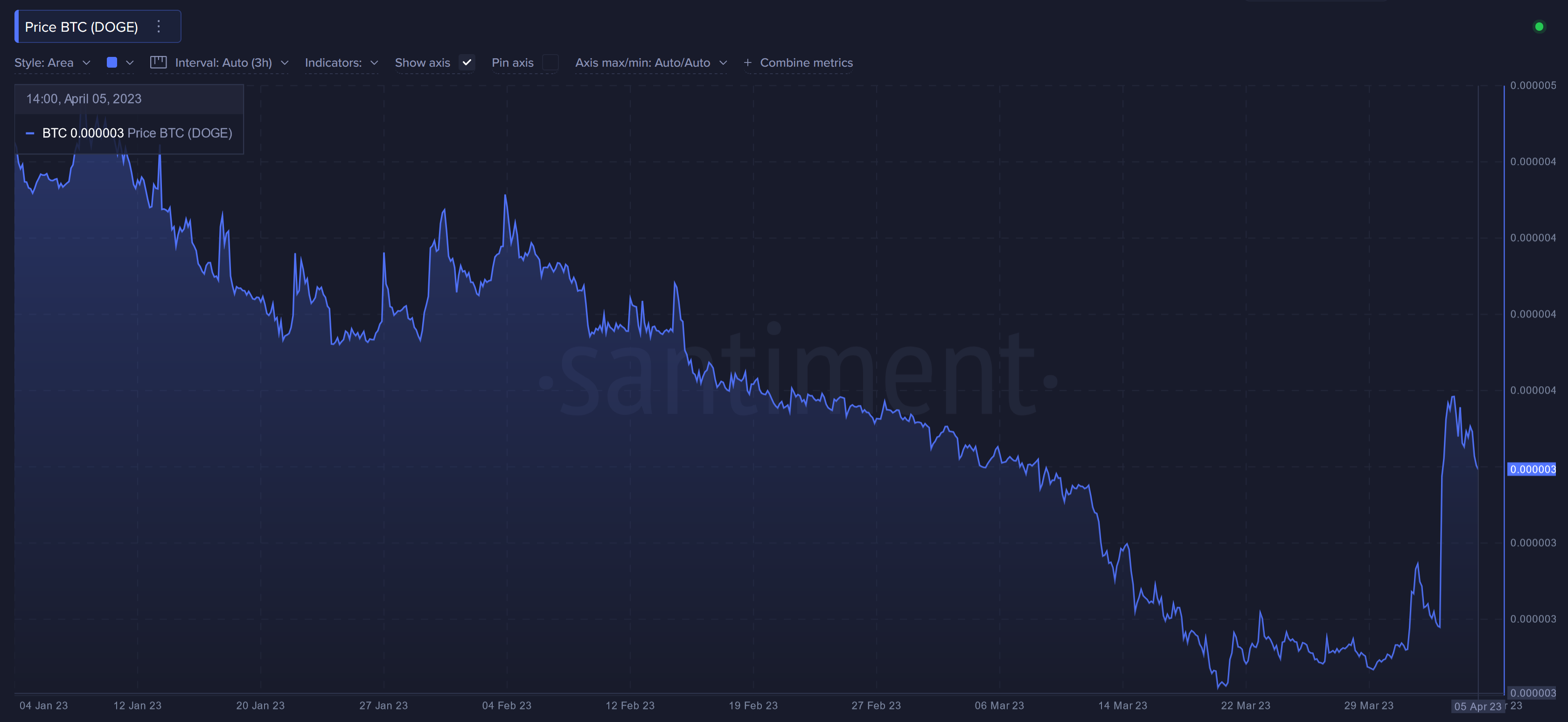
It's also worth noting that this pump by the famous meme-coin brought it back to the highest price in relation to BTC since February 23rd.

Looking at this chart, though, it's hard to get too excited that we're suddenly seeing a bit correlation break, with "lower highs" consistently being made even in the hours past yesterday's pump. "Higher highs" would be a much more solid indication that a bigger rally will be commencing soon.
-----
Disclaimer: The opinions expressed in the post are for general informational purposes only and are not intended to provide specific advice or recommendations for any individual or on any specific security or investment product.

